Overview
Apollo analytics offer actionable data you can use to monitor and improve your company's sales outreach. Use dashboards for at-a-glance visualizations to see how your team is performing, which contacts and accounts are most receptive to your engagement, and where to address bottlenecks in your sales pipeline.
Access to analytics depends on your Apollo plan. If your team needs access to analytics dashboards, upgrade your plan. If you have questions about upgrading, reach out to the Apollo sales team.
Check out the following sections to use analytics dashboards.
Access Dashboards
Did you know? You don't have to click through every step anymore. With the AI assistant, simply describe what you want to accomplish, and Apollo helps execute your goal.
To access dashboards:
- Launch Apollo and click Analytics > Dashboards.
- Apollo shares your dashboards, organized by default by creation date.
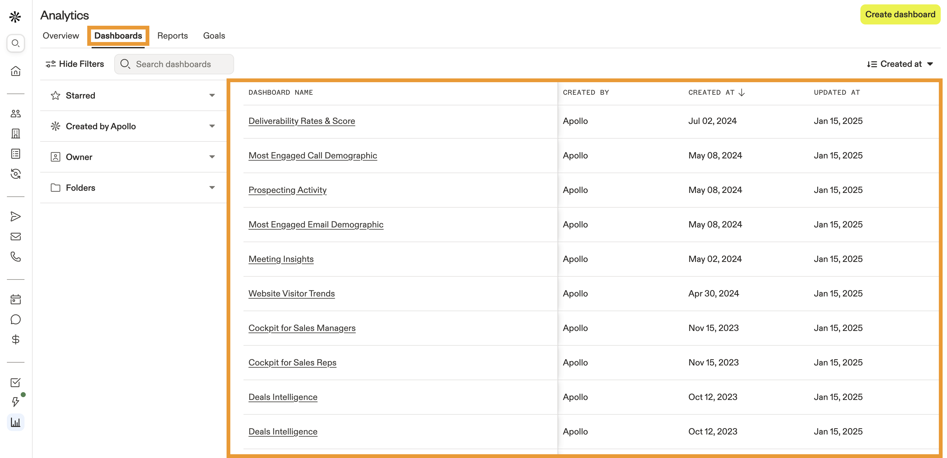
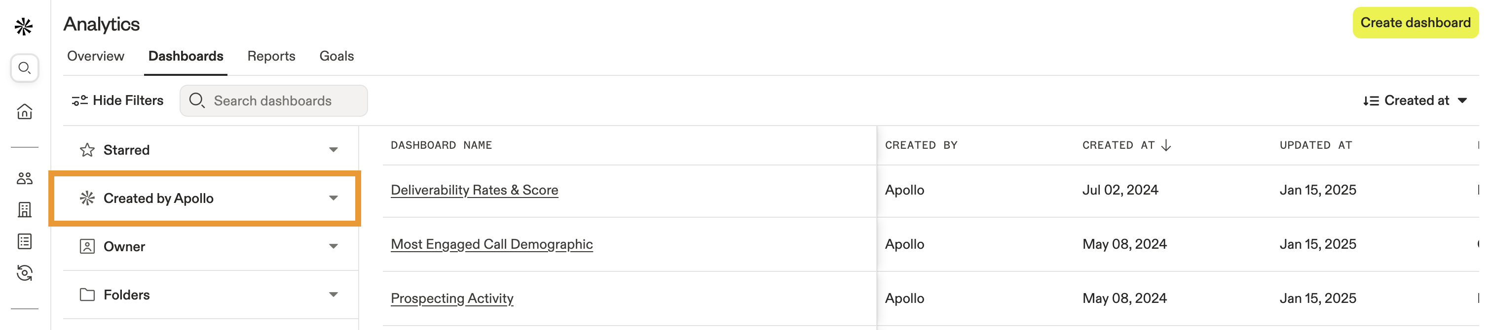
- Use search filters to find specific dashboards or click Created by Apollo to access pre-built, ready-to-use dashboards. Click to select a dashboard from the list.
Want to know more about a particular dashboard? Check out all of the dashboards created by Apollo.
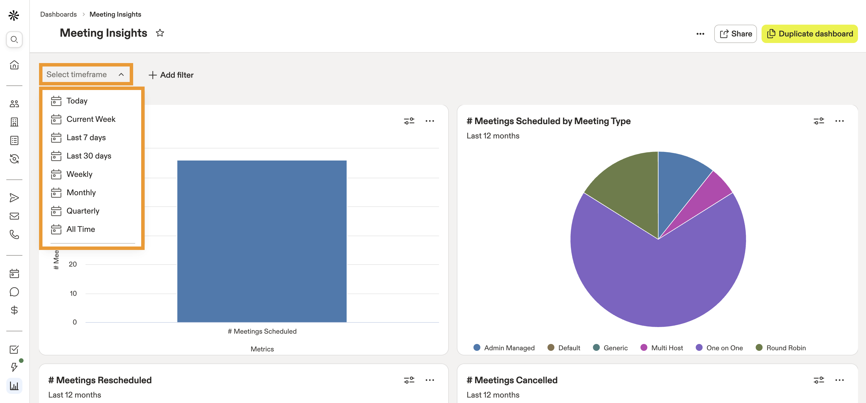
- Your selected dashboard populates report widgets automatically. Click Select timeframe to see metrics from:
- Today
- Current Week
- Last 7 days
- Last 30 days
- Weekly
- Monthly
- Quarterly
- All Time
- Click Add filter to include additional filters for your dashboard metrics. You can filter by users and teams, account stages, and more.

- Use the dropdown to select the criteria for your filter, or click Remove filter to delete the filter.

Dashboard filters don't override the filters present on the reports that drive dashboard widgets. Instead, dashboard filters act as add-ons to the existing filters in each report.
If you use a dashboard filter that conflicts with a filter from an underlying report, Apollo discards and replaces the report filter with the dashboard filter whenever you view the dashboard. However, when you view the report, the original filter remains in effect.
- After applying a date range and filters, Apollo automatically runs your dashboard to display the relevant metrics.
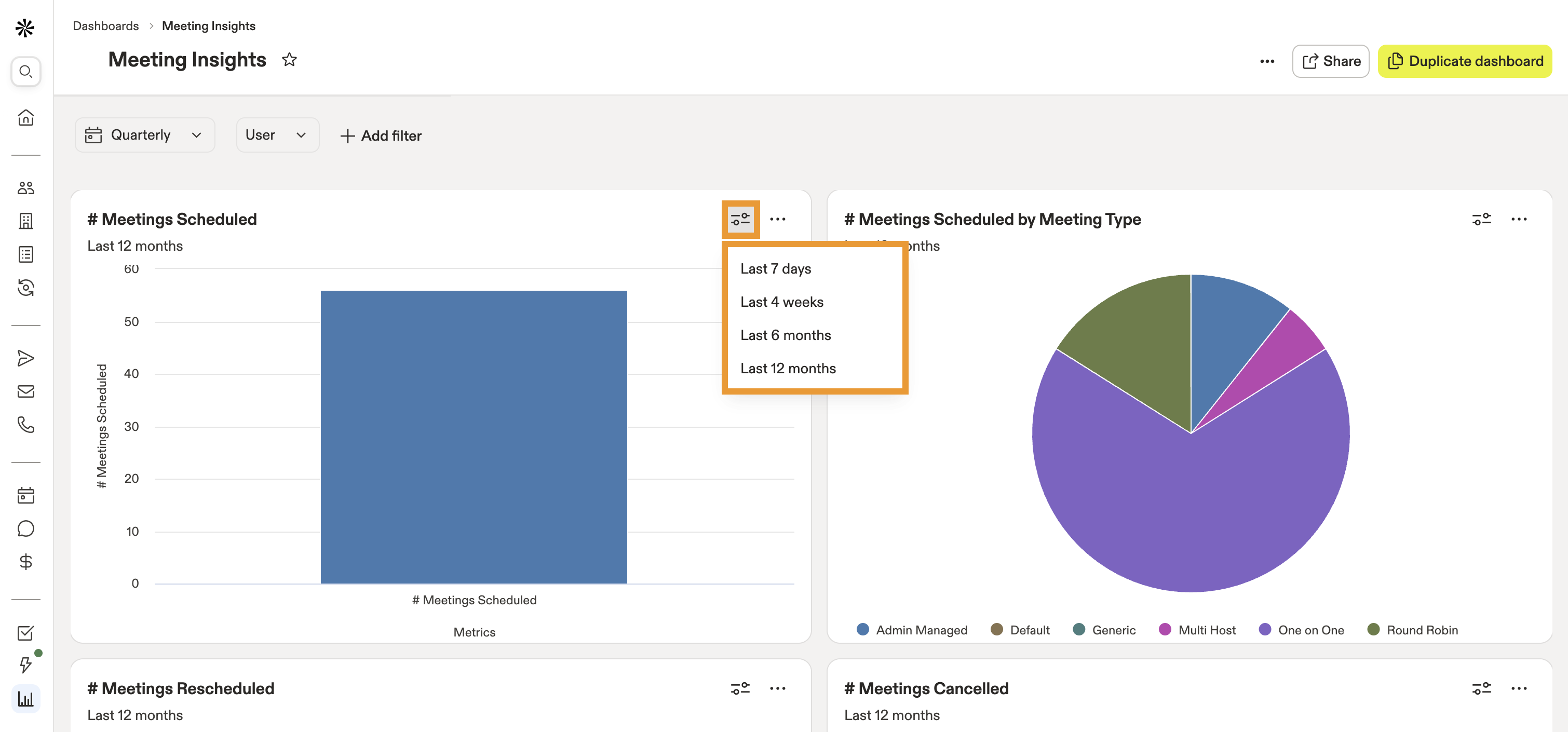
- Click filters within an individual widget to filter that widget's data by the last 7 days, 4 weeks, 6 months, or 12 months.
- Click ... > View Report within an individual widget to open the full report.
- Click ... > Duplicate to create a copy of the report within an individual widget.
- Click ... > Copy Link to send a link to this dashboard widget to your teammates.
- Click ... > Export to CSV to download the data from an individual widget to a CSV file.

You've now accessed analytics dashboards.
To use dashboards, you need permission to access analytics. If you don't have permission, reach out to an Apollo admin who can edit your permission profile.
Use Pre-Built Dashboards from Apollo
You can use the following dashboards created by Apollo:
Analytics Dashboards |
||
|---|---|---|
| Prospecting activity | Meeting insights | Most engaged email demographic |
| Most engaged call demographic | Website visitor trends | Deal analytics |
| Sales development activity | Call engagement | Email engagement |
| Deliverability rates & scores | Apollo Labs outbound sequence performance | Waterfall dashboard |
| Outbound dashboard | Inbound performance | |
Prospecting activity
Leverage this dashboard to gain high-level insights into your team's prospecting efforts.
To use the dashboard, ensure you set the correct date range, and click Run. Then review the following widgets to see how you're performing:
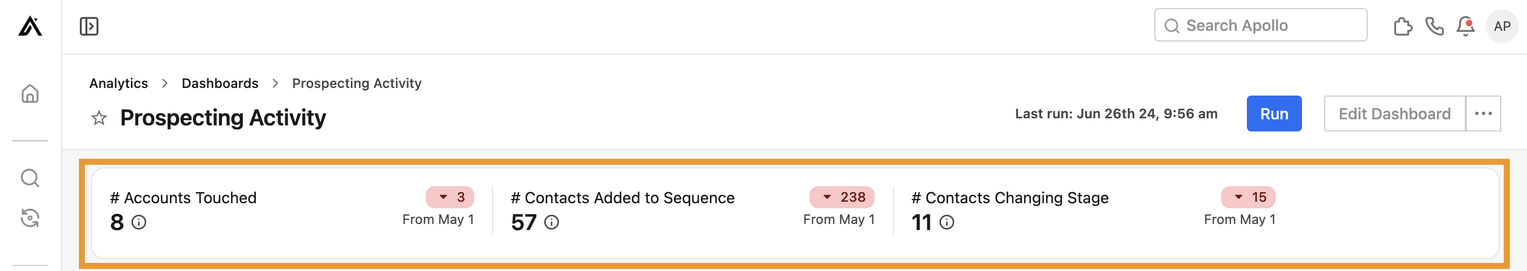
- # Accounts touched, contacts added to sequences, and contacts changed stage: View high-level account and contact movement, with totals for each activity and the upward or downward trend over time. Hover over a statistic for more details.
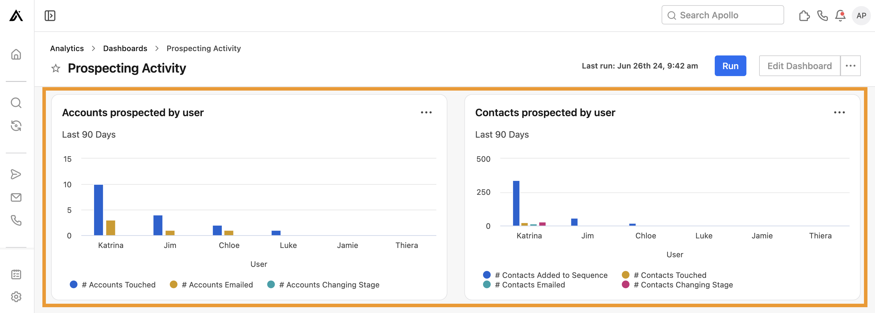
- Accounts prospected by user and contacts prospected by user: Visualize account and contact touches, emails, sequence additions, and stage changes by team member. Click ... beside either widget to view a more detailed report.
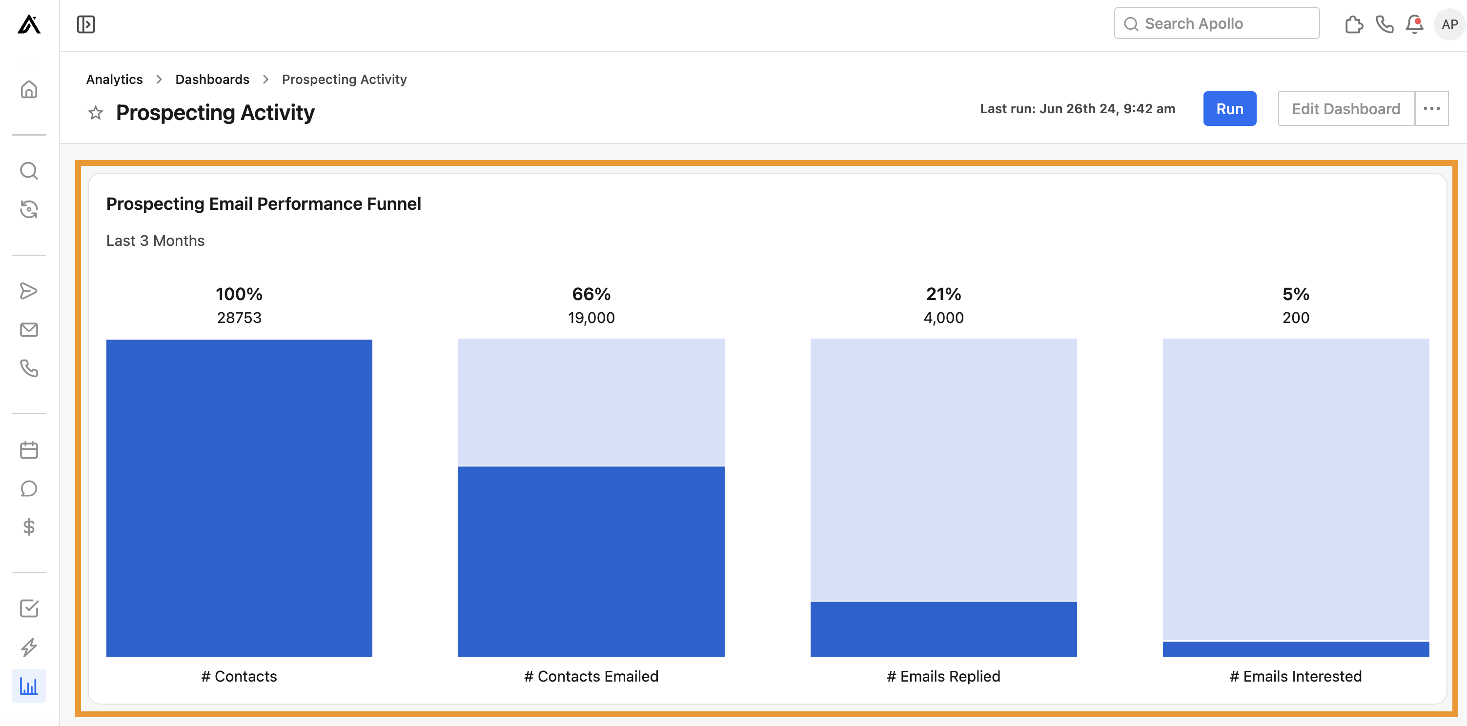
- Prospecting email performance funnel: View your email funnel performance. Each column represents the amount and percentage of contacts that moved from the prior status.
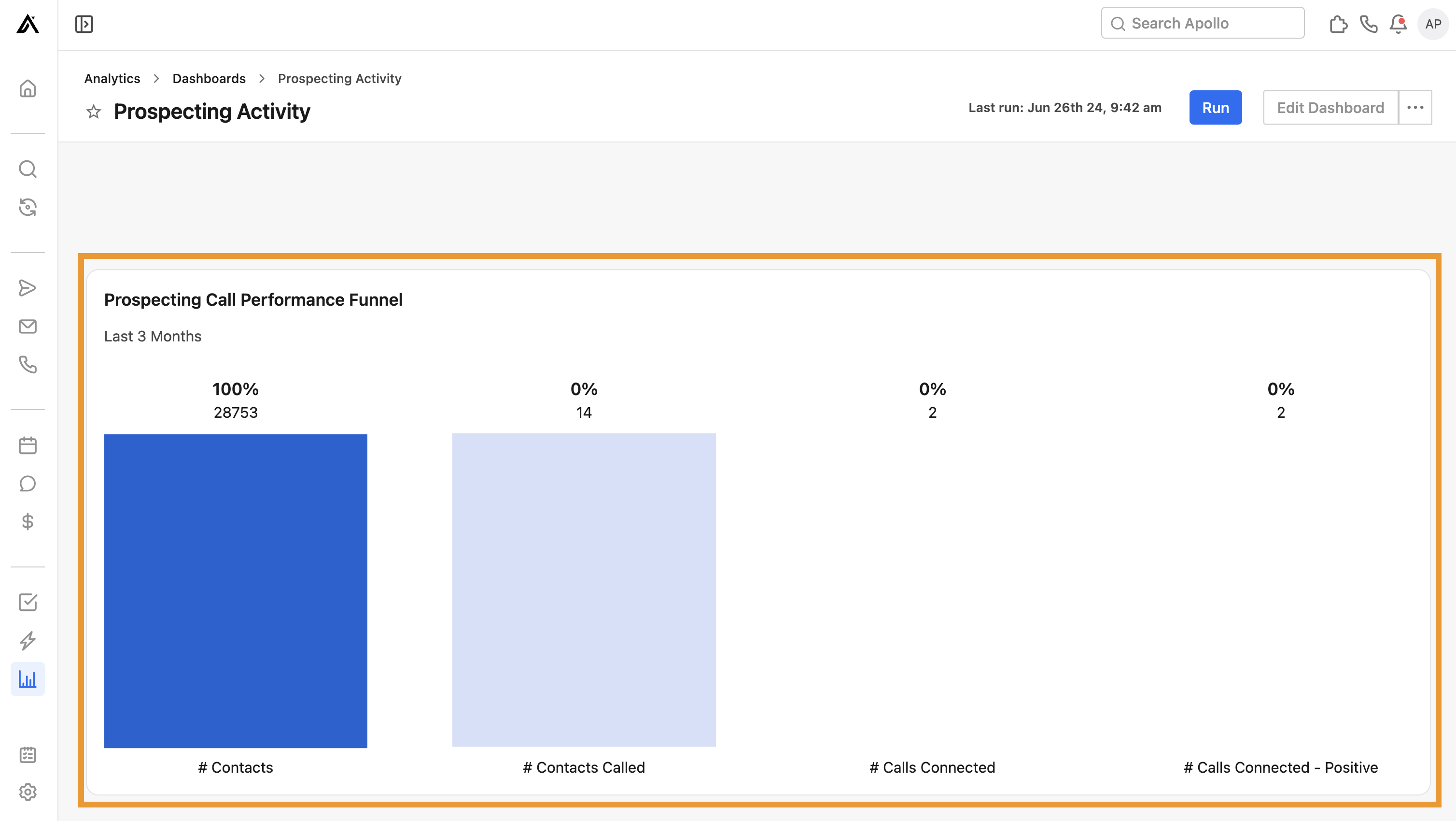
- Prospecting call performance funnel: Visualize your call funnel performance. Each column represents the amount and percentage of contacts that moved from the prior status.
You have now used the prospecting activity dashboard.
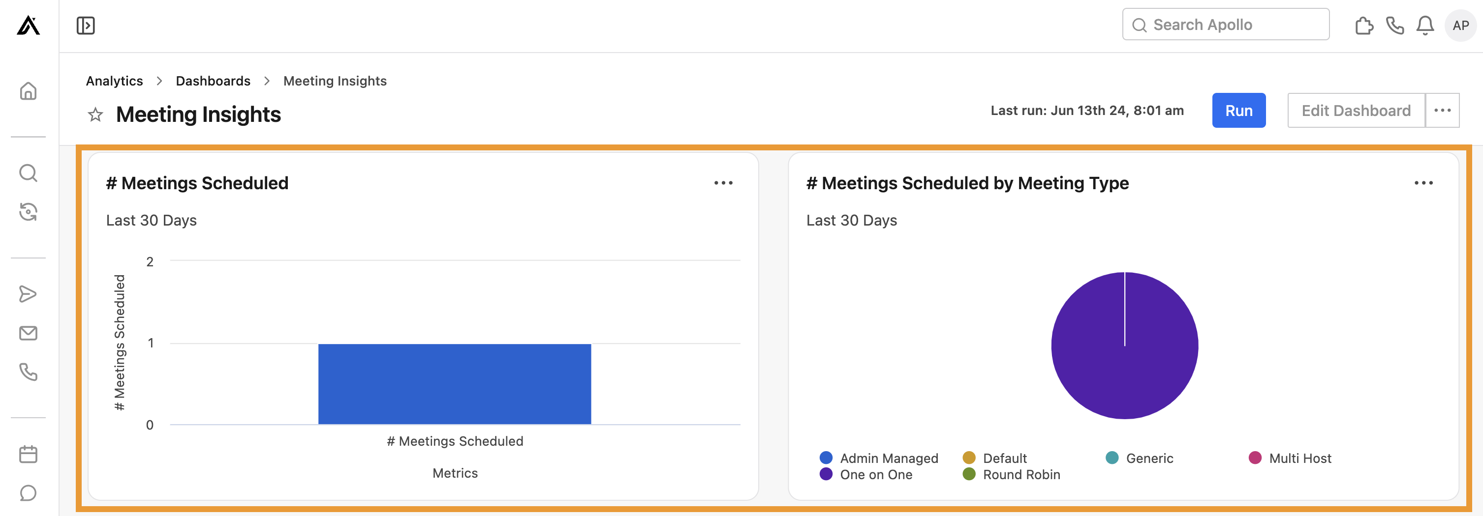
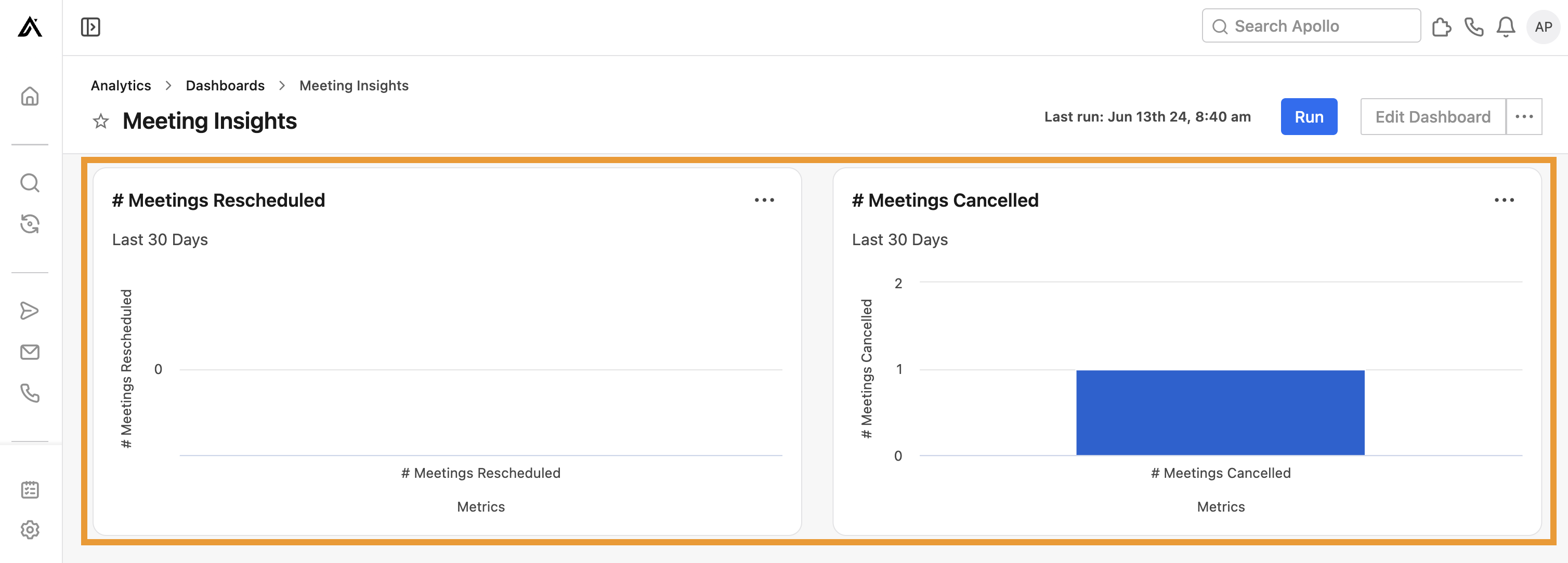
Meeting insights
Leverage this dashboard to help track team trends and identify areas for improvement in meeting scheduling, rescheduling, and cancellations. Apollo only provides insights on meetings scheduled with Apollo.
To use the dashboard, ensure you set the correct date range, and click Run. Then review the following widgets to see how you're performing:
- # Meetings scheduled: View the total number of meetings scheduled in Apollo.
- # Meetings scheduled by meeting type: View the total number of meetings scheduled in Apollo by type of meeting.
- # Meetings rescheduled: Visualize the total number of meetings rescheduled in Apollo.
- # Meetings cancelled: Views the total number of meetings your prospects have canceled in Apollo.
You have now used the meeting insights dashboard.
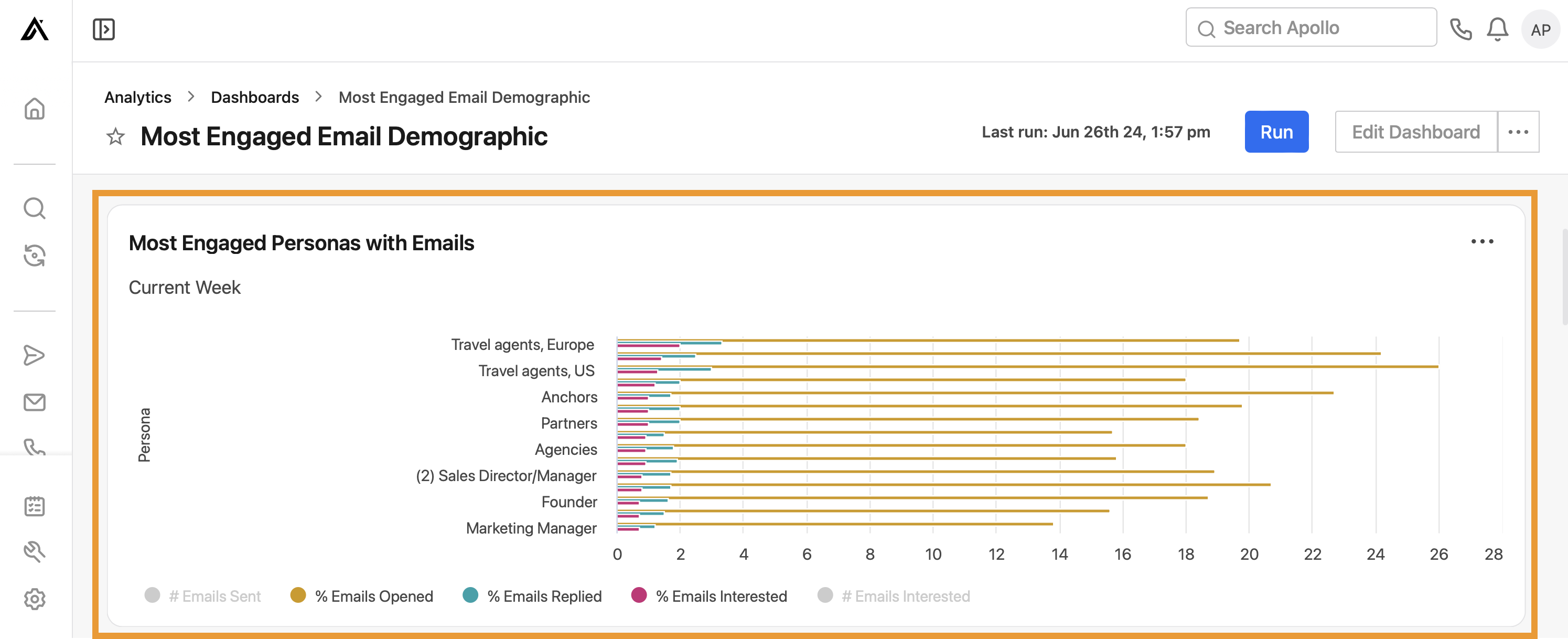
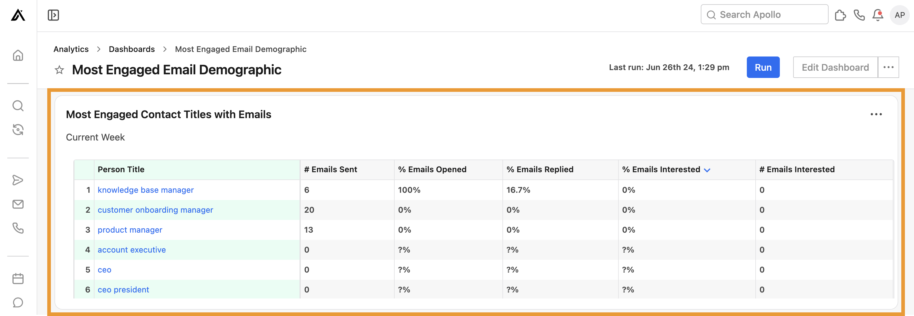
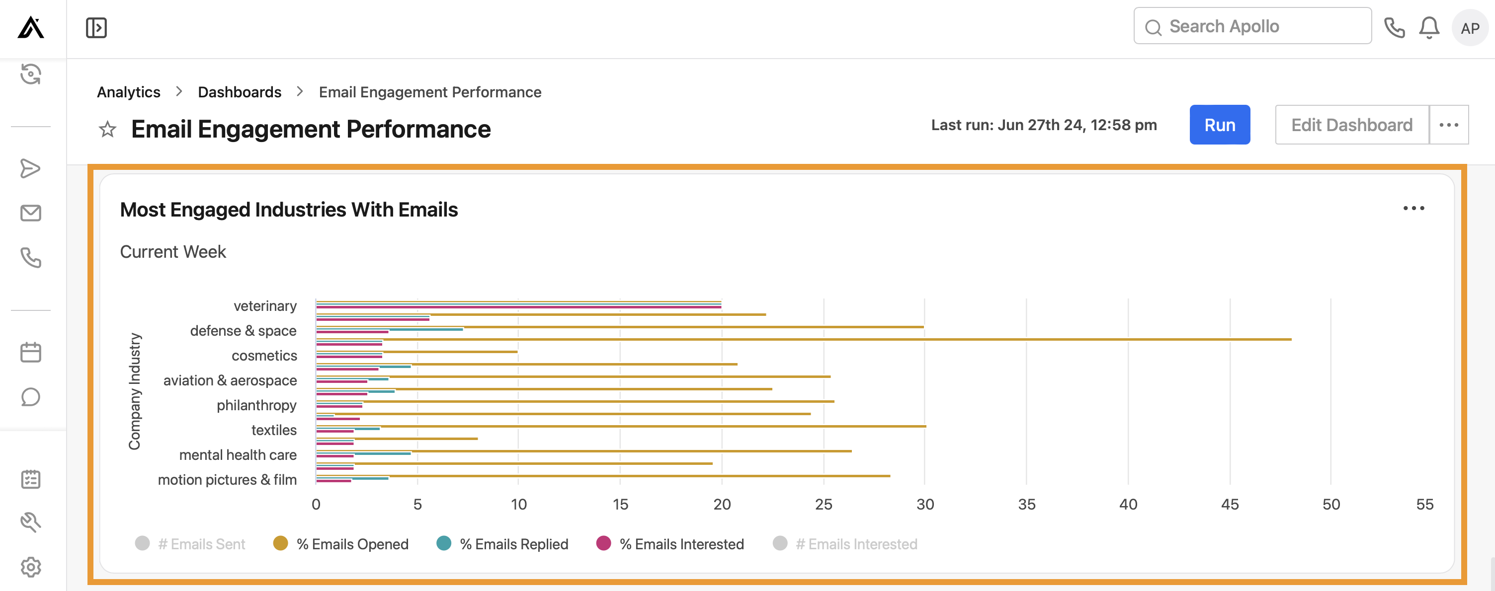
Most engaged email demographic
Leverage this dashboard to gain key details about the people most engaged with your team's emails.
To use the dashboard, ensure you set the correct date range, and click Run. Then review widgets to see how you're performing:
- Most engaged personas with emails: View the personas most engaged with your team's email outreach. Apollo displays the total number of emails sent and interested, along with the percentage of emails opened (excluding bot opens), replied, and interested by persona.
- Most engaged contact titles with emails: View the total number of emails sent and emails interested, as well as the percentage of emails opened, replied, and interested by contact job title.
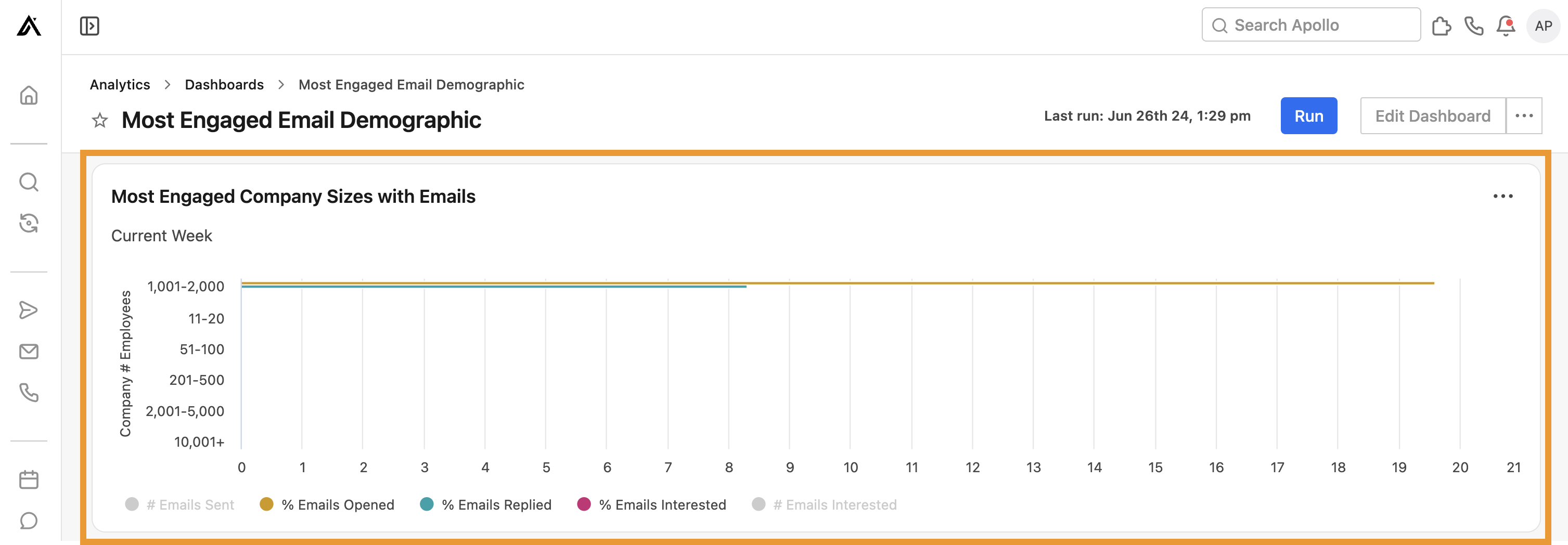
- Most engaged company sizes with emails: Visualize the number of emails sent and emails interested, as well as the percentage of emails opened (excluding bot opens), replied, and interested by number of company employees.
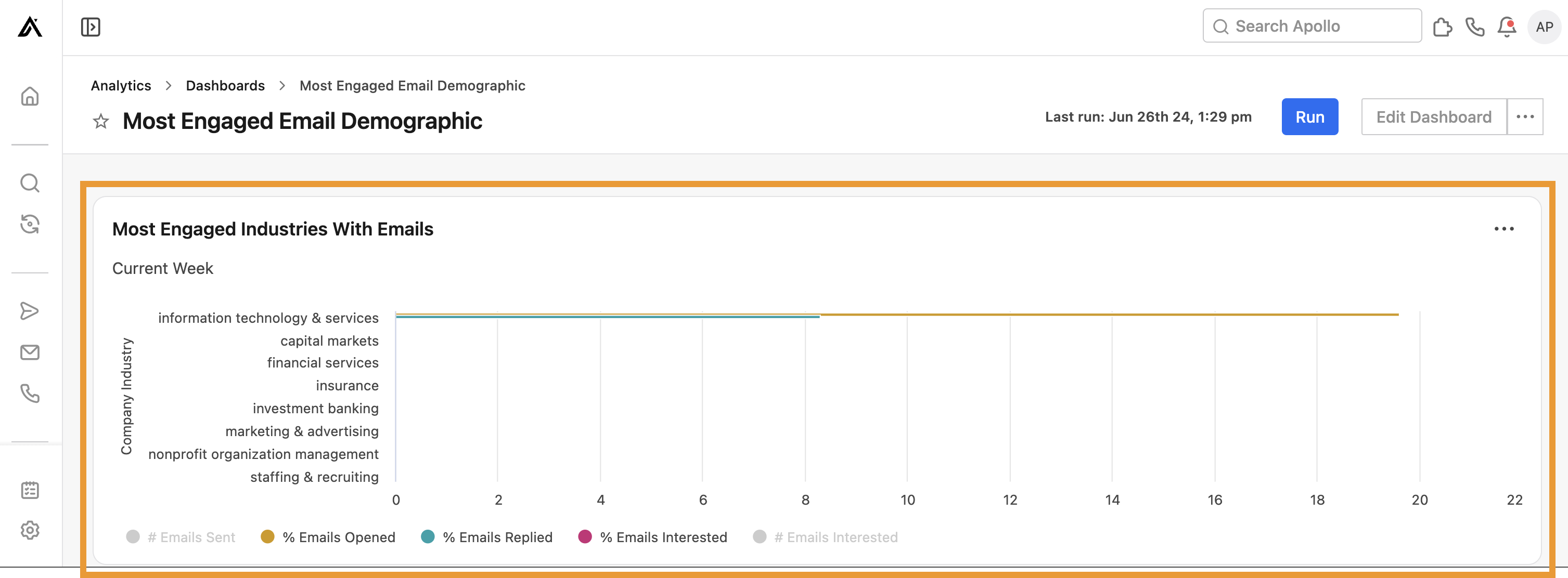
- Most engaged industries with emails: Visualize the number of emails sent and emails interested, as well as the percentage of emails opened (excluding bot opens), replied, and interested by company industry.
You have now used the most engaged email demographic dashboard.
Most engaged call demographic
Leverage this dashboard to access key demographic details about the people most engaged with your team's calls.
To use the dashboard, ensure you set the correct date range, and click Run. Then review the following widgets to see how you're performing:
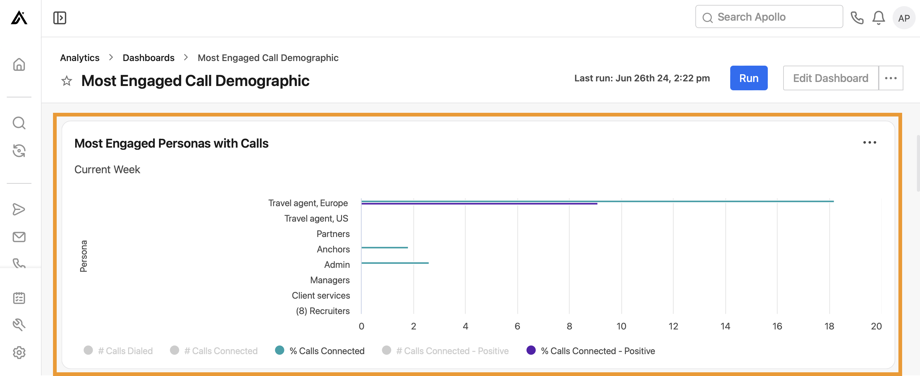
- Most engaged personas with calls: View the personas most engaged with your team's call outreach. Apollo displays the number of calls dialed, connected, and connected-positive, as well as the percentage of calls connected and connected-positive, by persona.
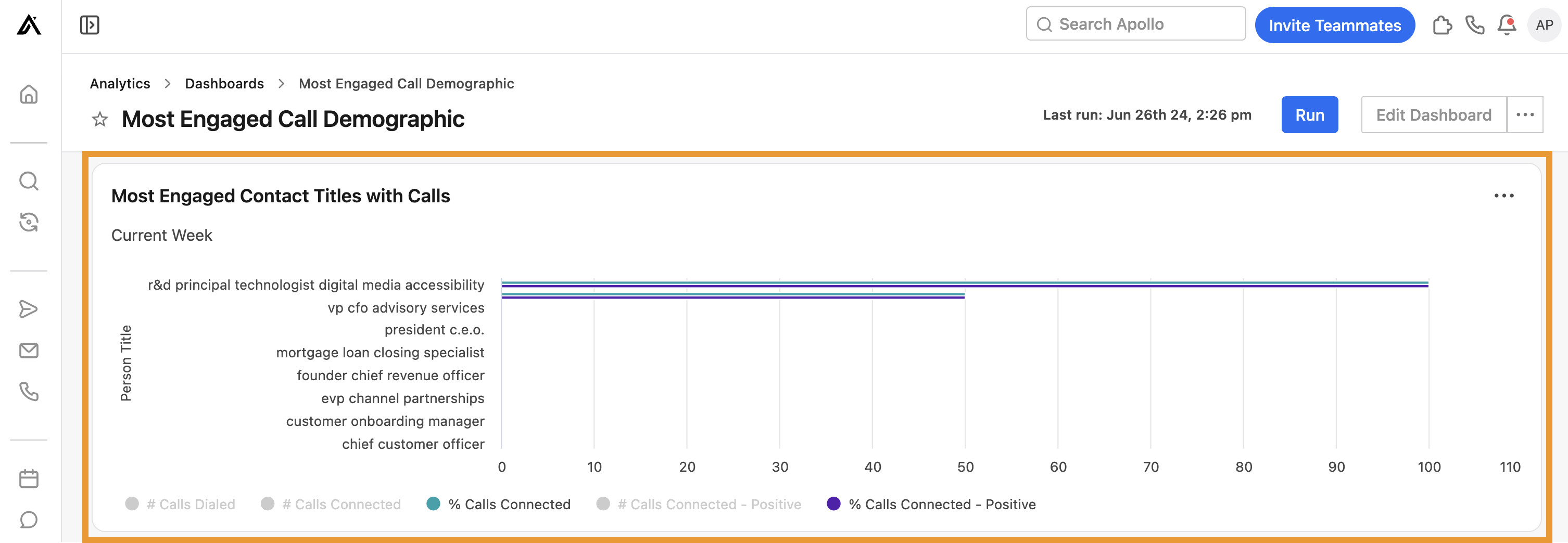
- Most engaged contact titles with calls: View the total number of calls dialed, connected, and connected-positive, as well as the percentage of calls connected and connected-positive by contact job title.
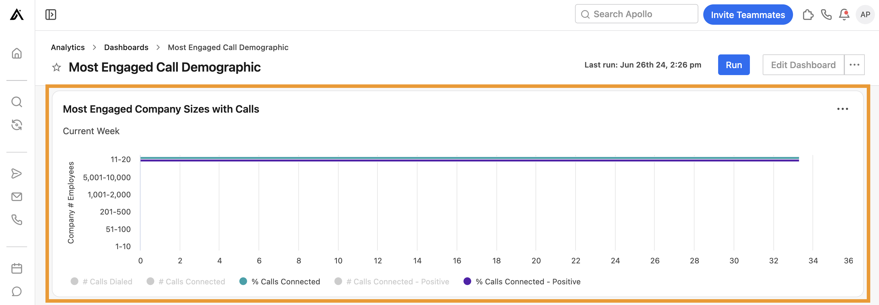
- Most engaged company sizes with calls: Visualize the total number of calls dialed, connected, and connected-positive, as well as the percentage of calls connected and connected-positive by the number of company employees.
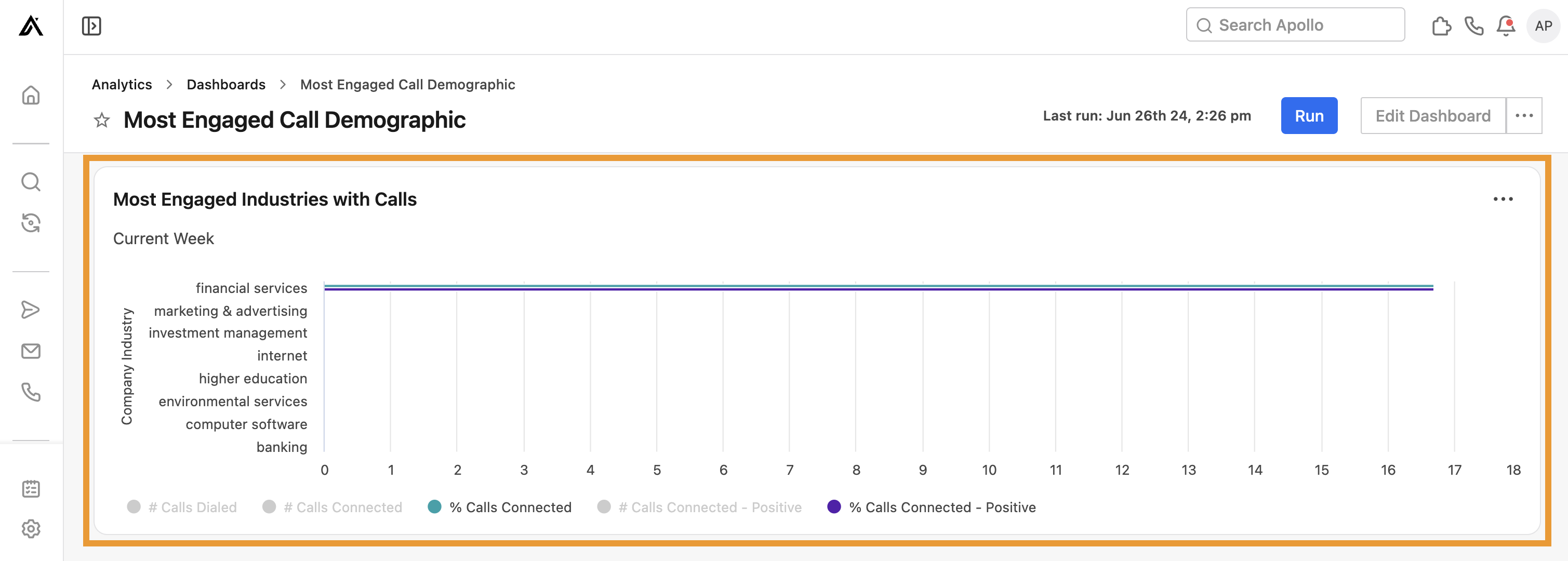
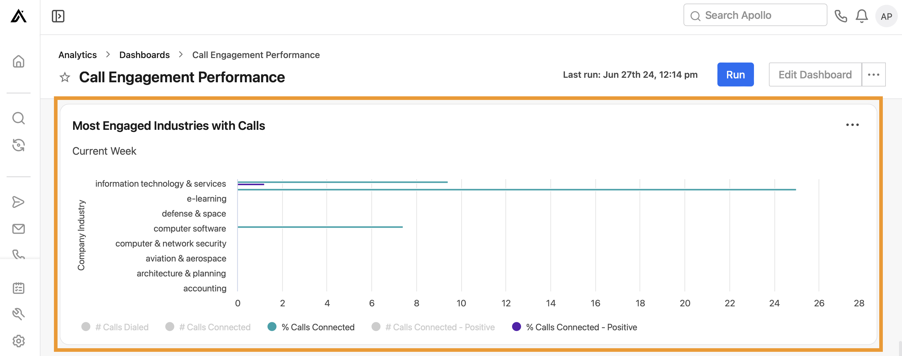
- Most engaged industries with calls: Visualize the total number of calls dialed, connected, and connected-positive, as well as the percentage of calls connected and connected-positive by industry.
You have now used the most engaged call demographic dashboard.
Website visitor trends
To report on website visitor trends, enable website visitor tracking.
Leverage this dashboard to view analytics on your website visitors.
To use the dashboard, ensure you set the correct date range, and click Run. Then review the following widgets to see how you're performing:
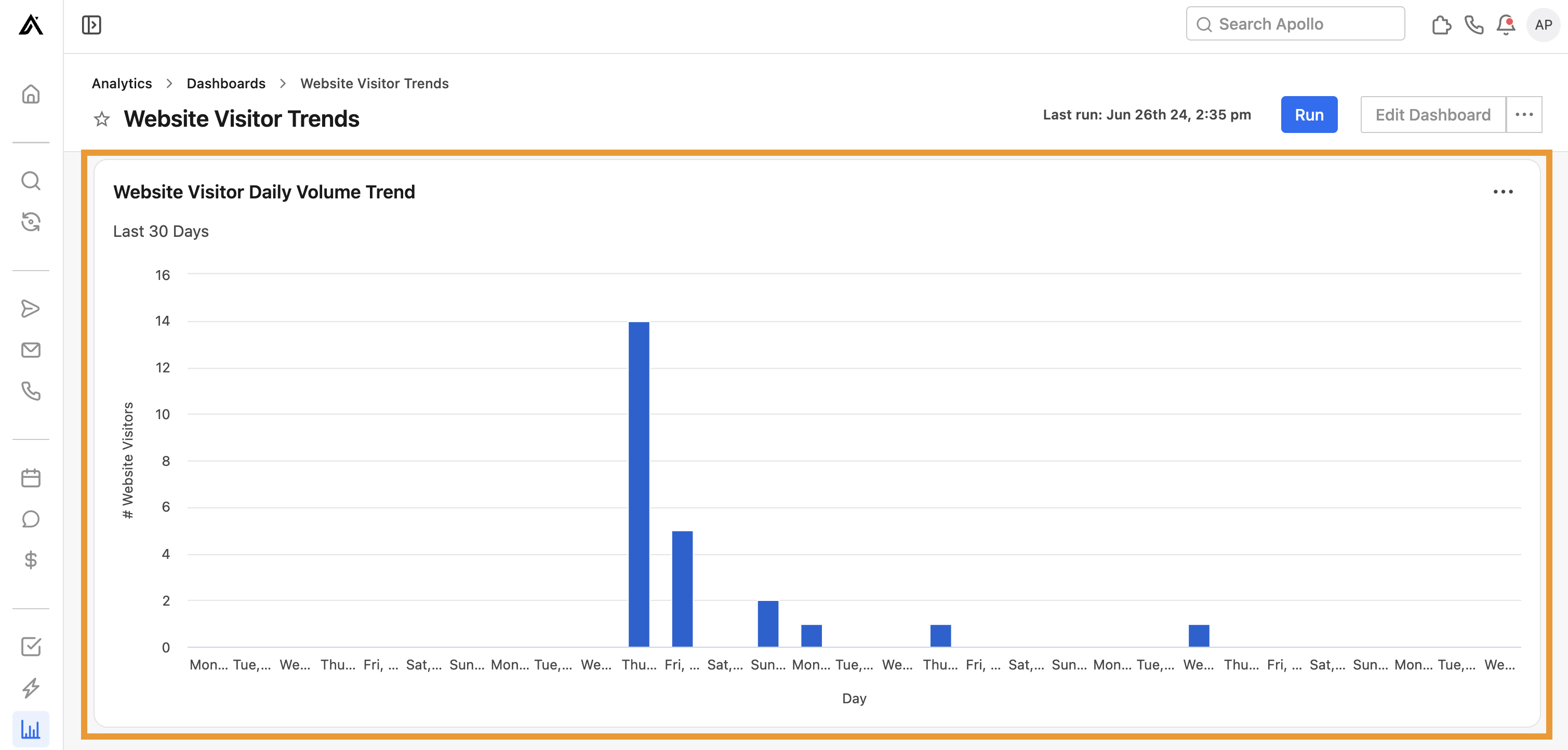
- Website visitor daily volume trend: Visualize the daily number of visitors to your website.
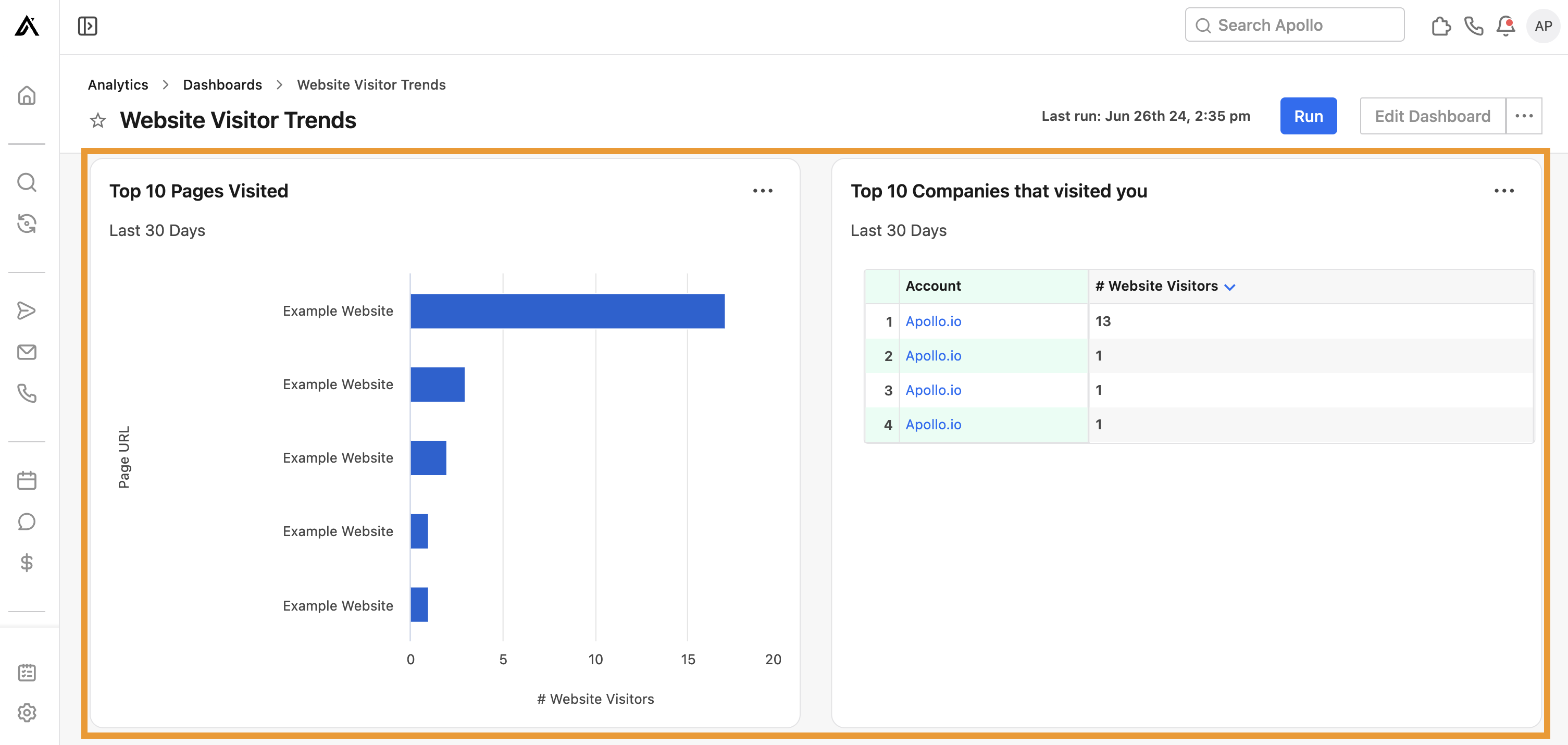
- Top 10 pages visited: View the top ten pages visited with the number of visitors by page URL.
- Top 10 companies that visited: View the top ten companies that visited your websites, with the number of visitors per company.
Website visitor data refreshes daily. New results show every 24-48 hours.
You have now used the website visitor trends dashboard.
Deal analytics
Leverage this dashboard to gauge the health of your sales pipeline.
To use the dashboard, ensure you set the correct date range, and click Run. Then review the following widgets to see how you're performing:
- Deal win rate: View the deal win rate per user. This is a measurement of total deals owned-closed divided by the total number of deals closed-won. Use this widget to quickly review your team's performance.

- Deals conversion as percentage: View the percentage per stage of deals that changed stage. Use this widget to identify bottlenecks in your deal pipeline.
- Deals conversion per stage: View the number of deals per stage that changed stage. Use this widget to identify bottlenecks in your deal pipeline.

- Pipeline deal conversion as percentage: View the percentage of deals that originated in your pipeline stages. Use this widget to ensure deals are flowing through each stage of your deal pipeline as expected.
- Pipeline deal conversion: View the number of deals that orgiinated in your pipeline stages. Use this widget to ensure deals are flowing through each stage of your deal pipeline as expected.

- Number of deals by deal stage and user: View the number of deals by deal stage per user. Use this widget to review deal status across your team.

- User-specific deal stage-wise forecast revenue: View the forecasted revenue per user-specific deal stage for the last 90 days. Use this report to see how your team is contributing to revenue.

- Deal win rate by industry: View the percentage of deal wins by industry. Use this widget to hone in on the types of industries most receptive to your product or service.

- Deal win rate by company size: View the percentage of deal win rates by company employee size. Use this widget to hone in on the company sizes most receptive to your product or service.

- Deal win rate by company revenue: View the percentage of deal win rates by company revenue. Use this widget to hone in on the types of companies most receptive to your product or service.

- Pipeline + closed deal dollar value by month: View the pipeline closed deal dollar value per month to gain insights into monthly deal revenue.
- Deal weighted value by month: View the deal forecast revenue by month for insights into monthly deal revenue.

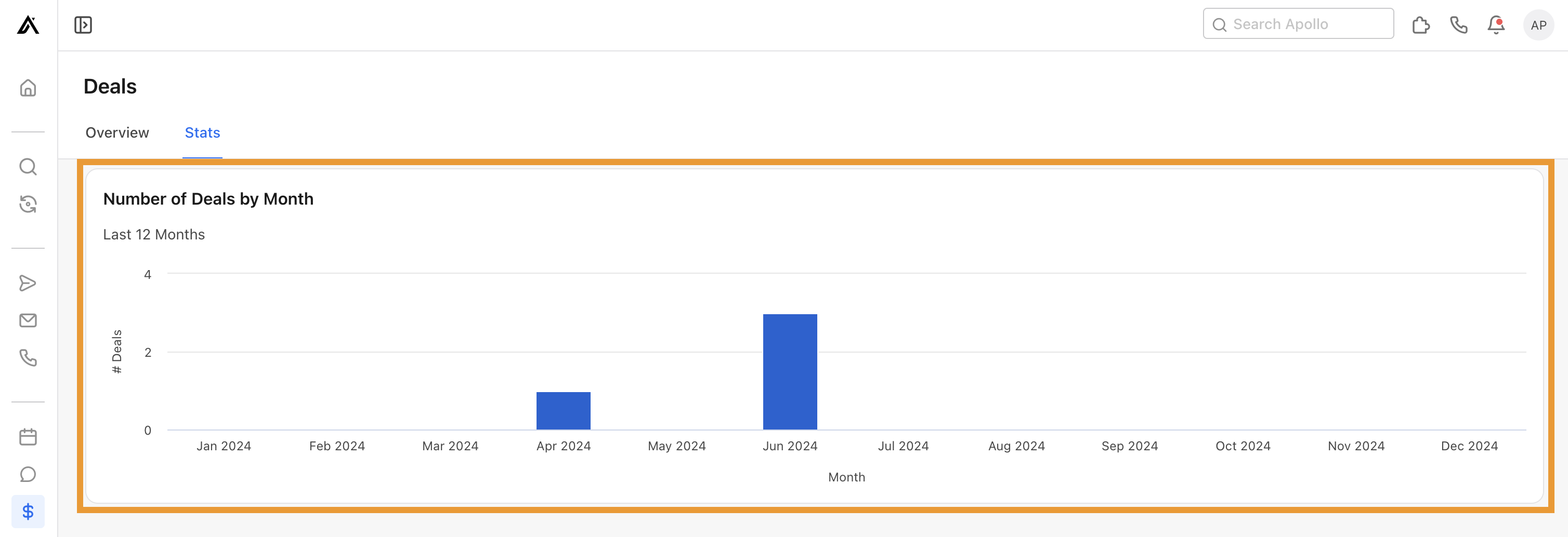
- Number of deals by month: View the number of deals by month for the past 12 months. Use this widget for insights into monthly deal revenue.
You have now used the deals analytics dashboard.
Sales development activity
Leverage this dashboard to gain insight into your teams' prospecting activities.
To use the dashboard, ensure you set the correct date range, and click Run. Then review the following widgets to see how you're performing:
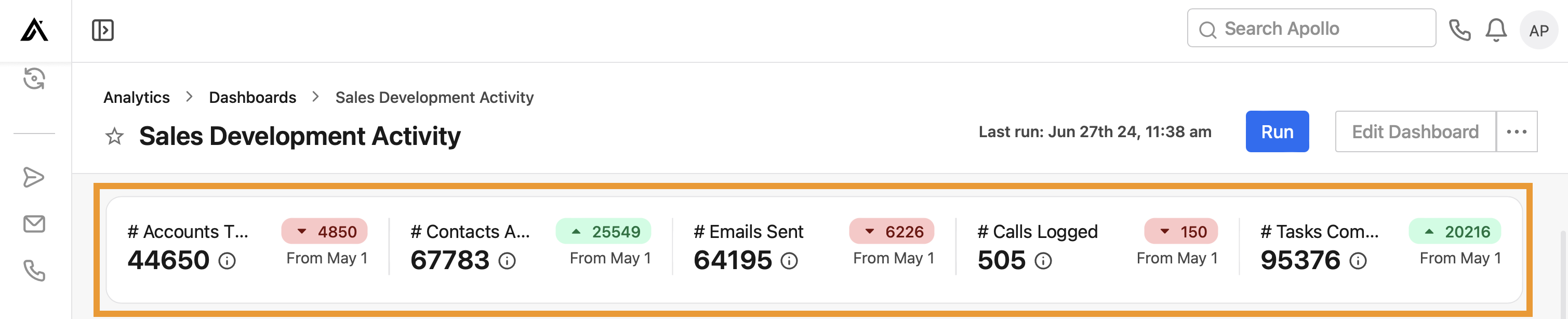
- # accounts touched, # contacts added to sequences, # emails sent, # calls logged, # tasks completed: View high-level prospecting touches across your team, with totals for each activity and the upward or downward trend over time. Hover over a statistic for more details.
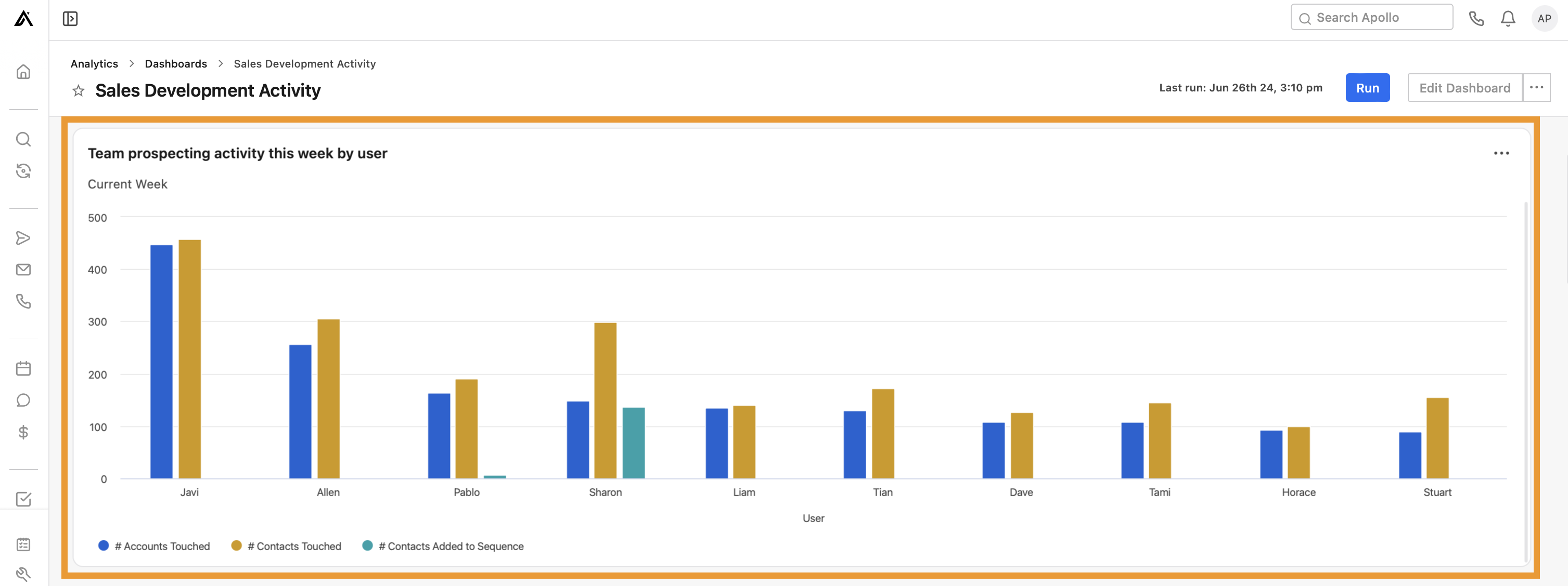
- Team prospectivity activity this week by user: View the number of contacts and accounts touched, and the number of contacts added to sequences by user.
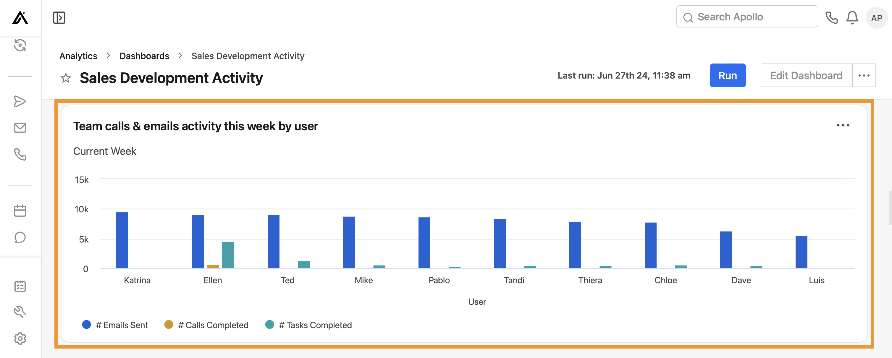
- Team calls & emails activity this week by user: View the number of emails each user has sent, and calls and tasks they have completed.
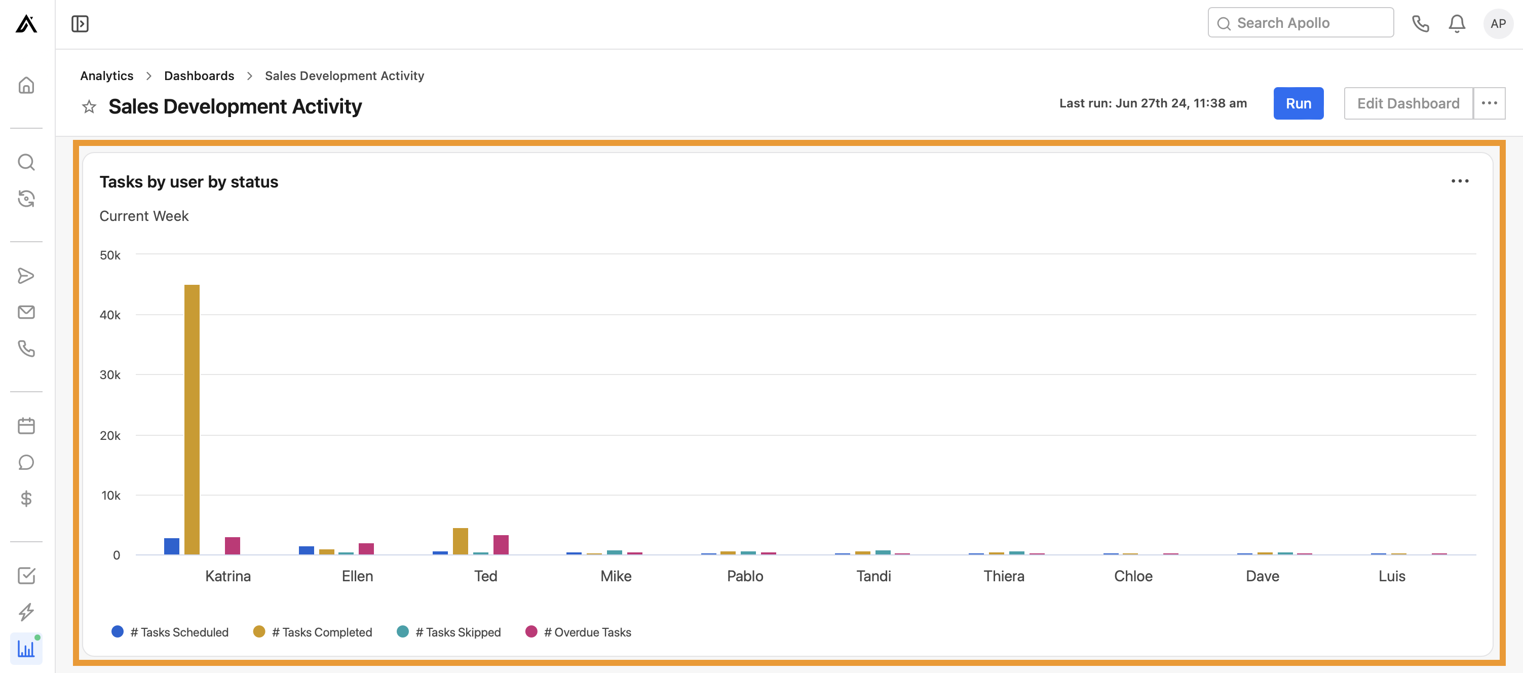
- Tasks by user by status: View the number of tasks each user has scheduled, completed, skipped, and overdue.
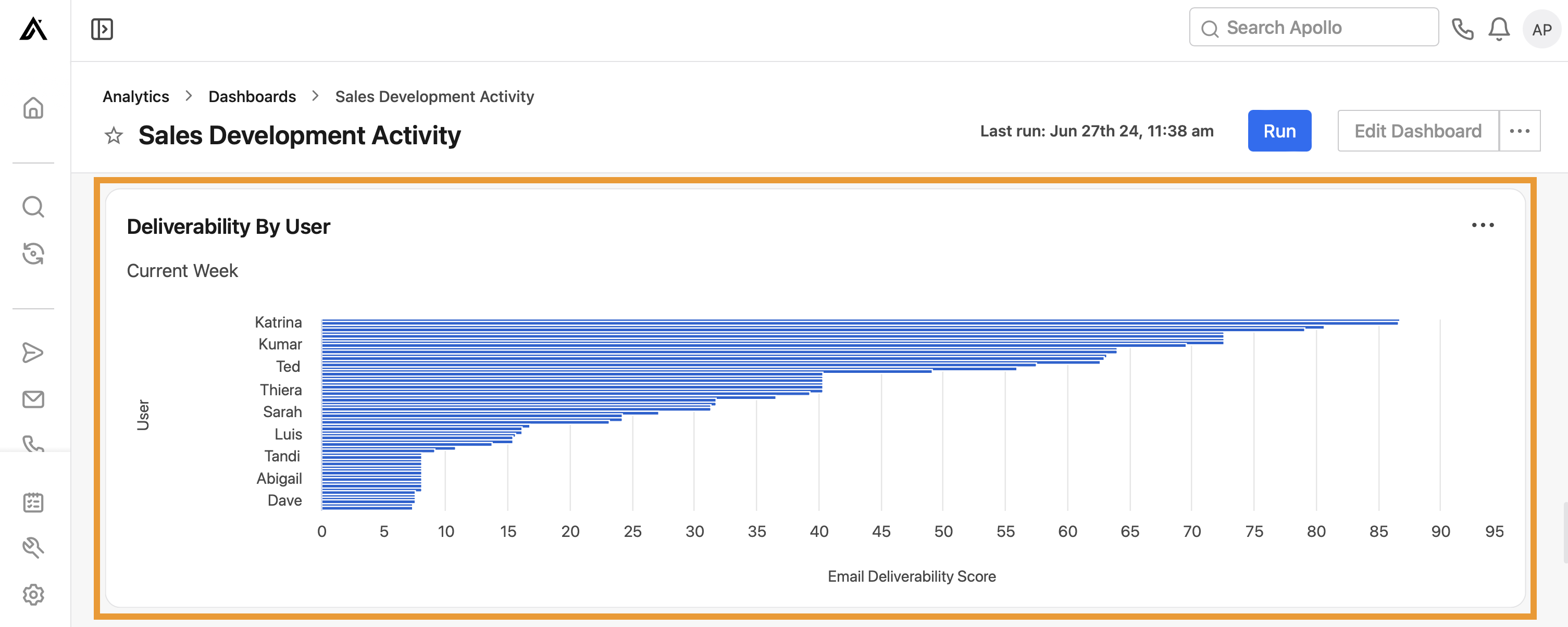
- Deliverability by user: View each user's current email deliverability score.
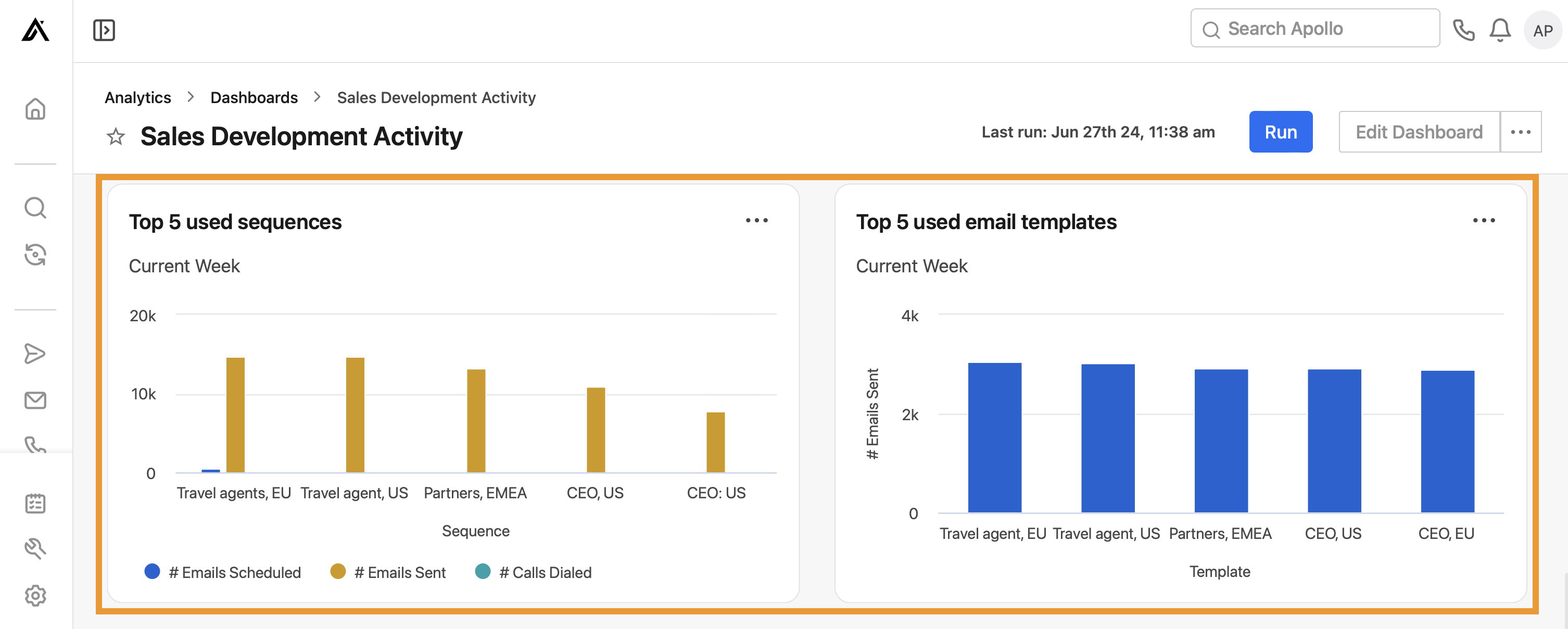
- Top 5 used sequences: View the top 5 used sequences across the team, with the number of emails scheduled and sent, and calls dialed.
- Top 5 used email templates: View the top 5 used email templates across the team.
You have now used the sales development activity dashboard.
Call engagement
This dashboard shares insights into your team's call performance using the dialer.
To use the dashboard, ensure you set the correct date range, and click Run. Then review the following widgets to see how you're performing:
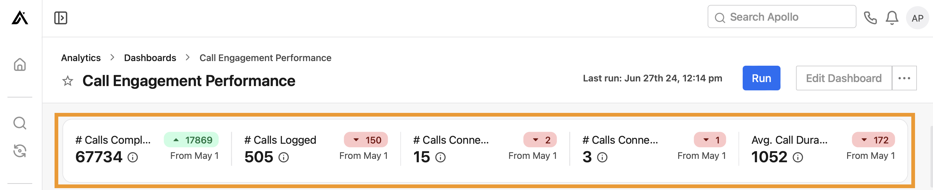
- # calls completed, # calls logged, # calls connected, and average call duration: Visualize high-level call touches across your team, with totals for each activity and the upward or downward trend over time. Hover over a statistic for more details.
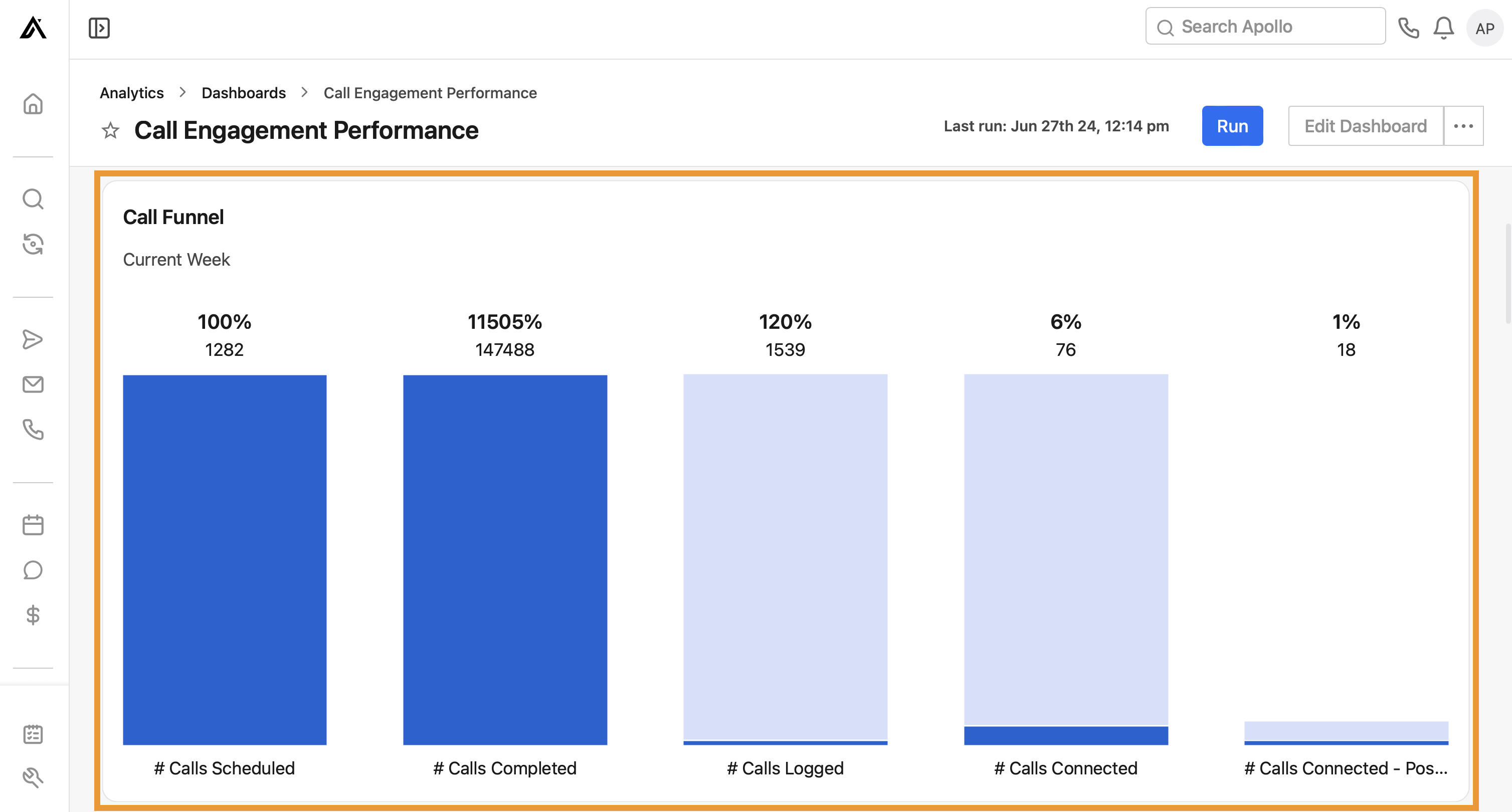
- Call funnel: View your call funnel performance. Each column represents the amount and percentage of contacts that moved from the prior status.
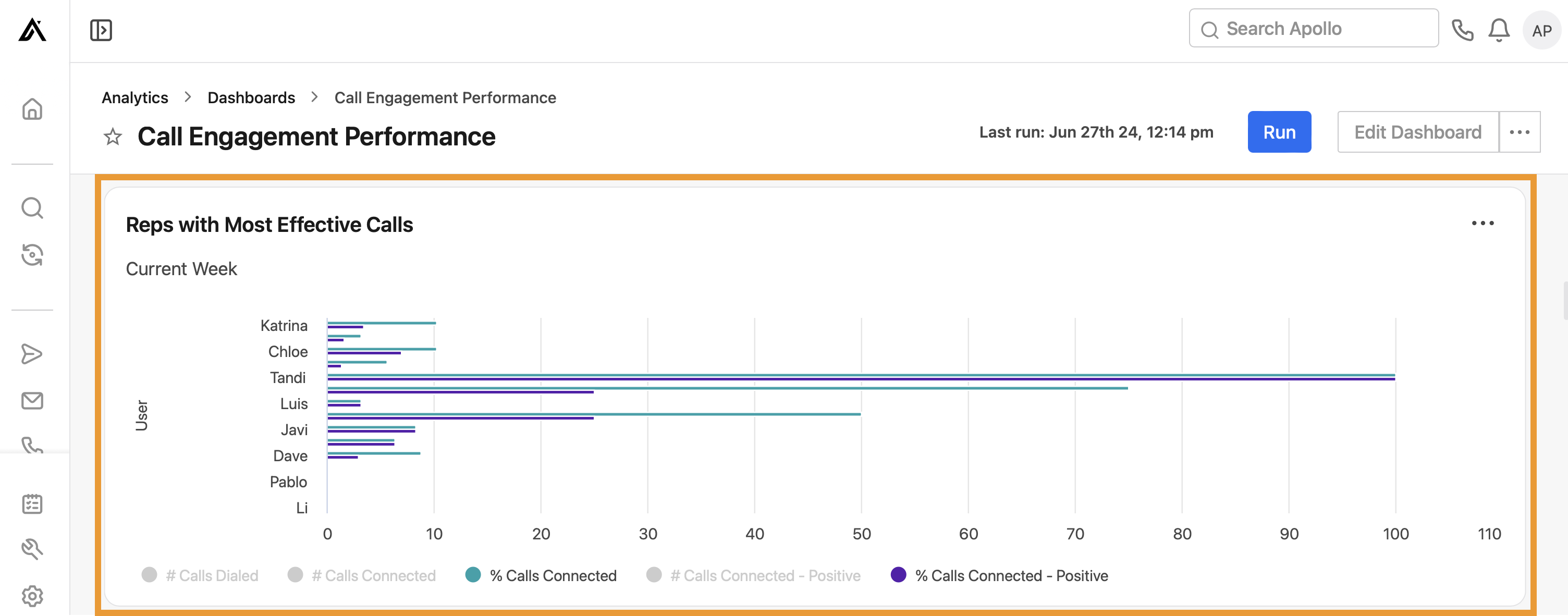
- Reps with most effective calls: View the reps with the most effective calls by number of calls dialed, connected, and connected-positive, and percentage of calls connected and connected-positive.
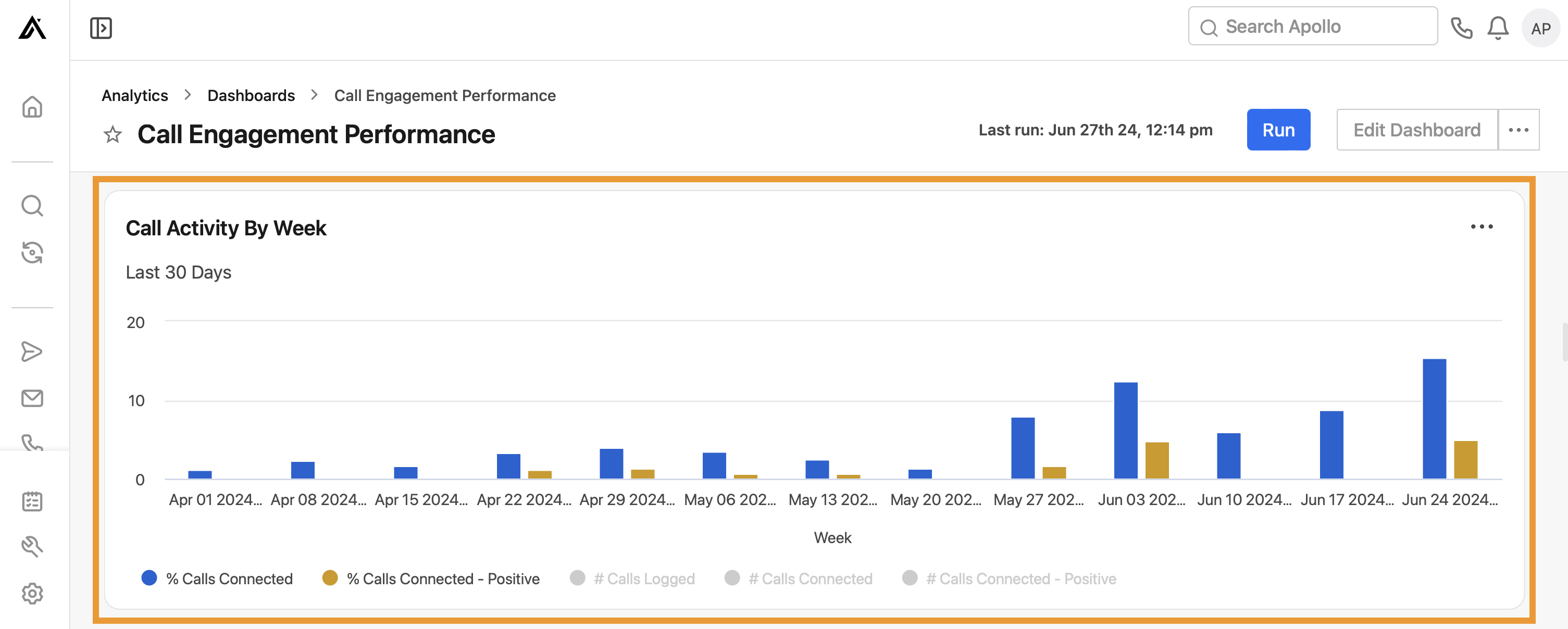
- Call activity by week: View the number of calls logged, connected, and connected-positive, as well as the percentage of calls connected and connected-positive.
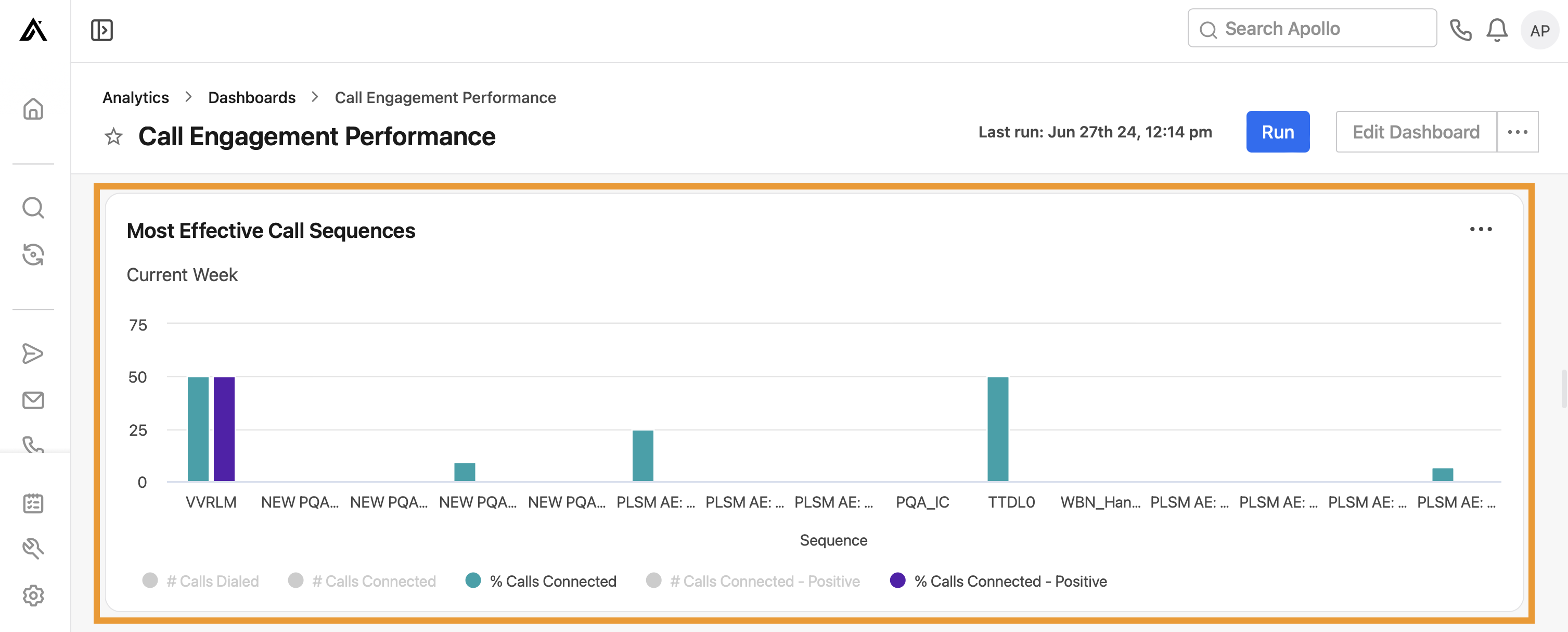
- Most effective call sequences: View the sequences with the most effective calls. This includes the number of calls dialed, connected, and connected-positive, and the percentage of calls connected and connected-positive.
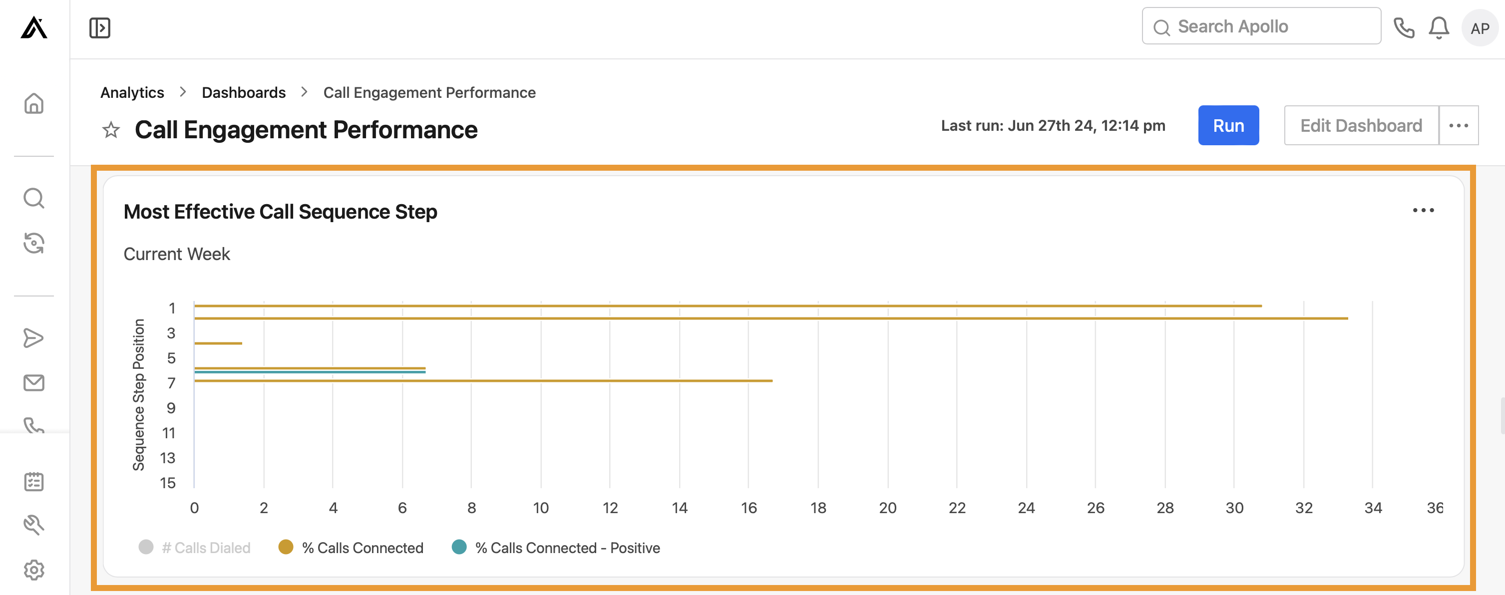
- Most effective call sequence step: View the sequence step position with the most effective calls, by the number of calls dialed and percentage of calls connected and connected-positive.
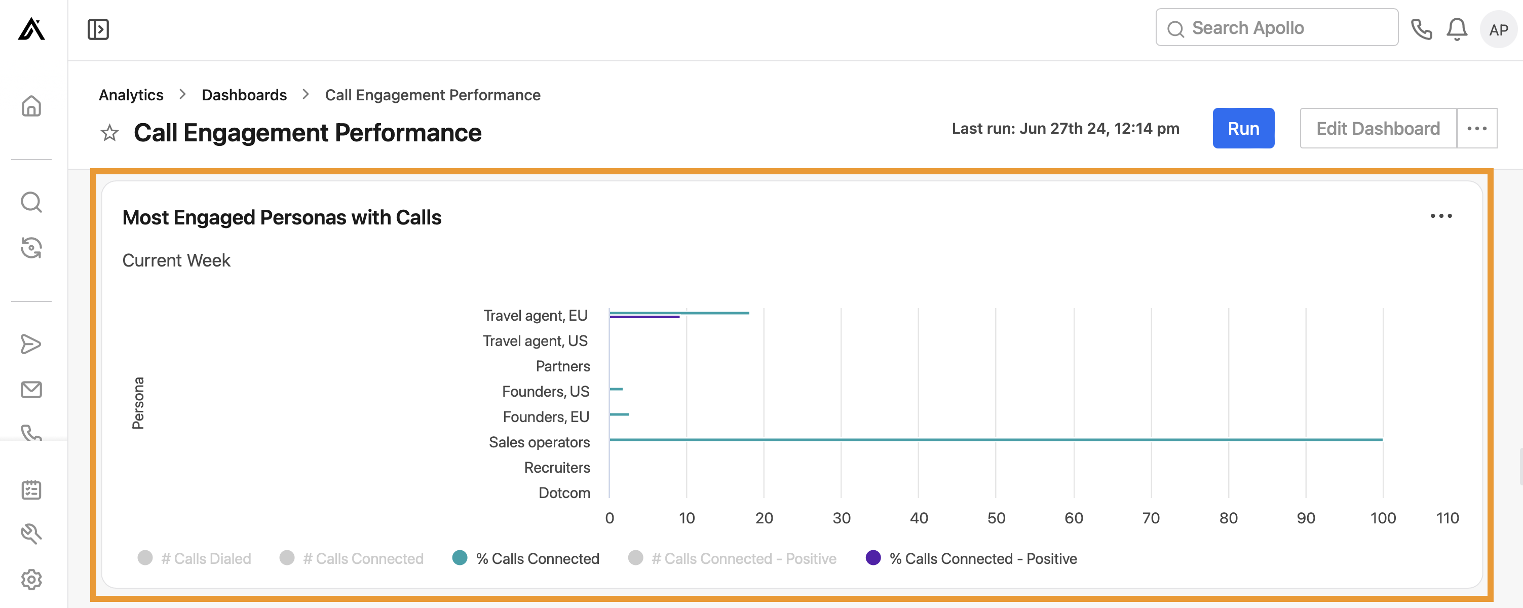
- Most engaged personas with calls: View the most engaged personas by number of calls dialed, connected, and connected-positive, and the percentage of calls connected and connected-positive.
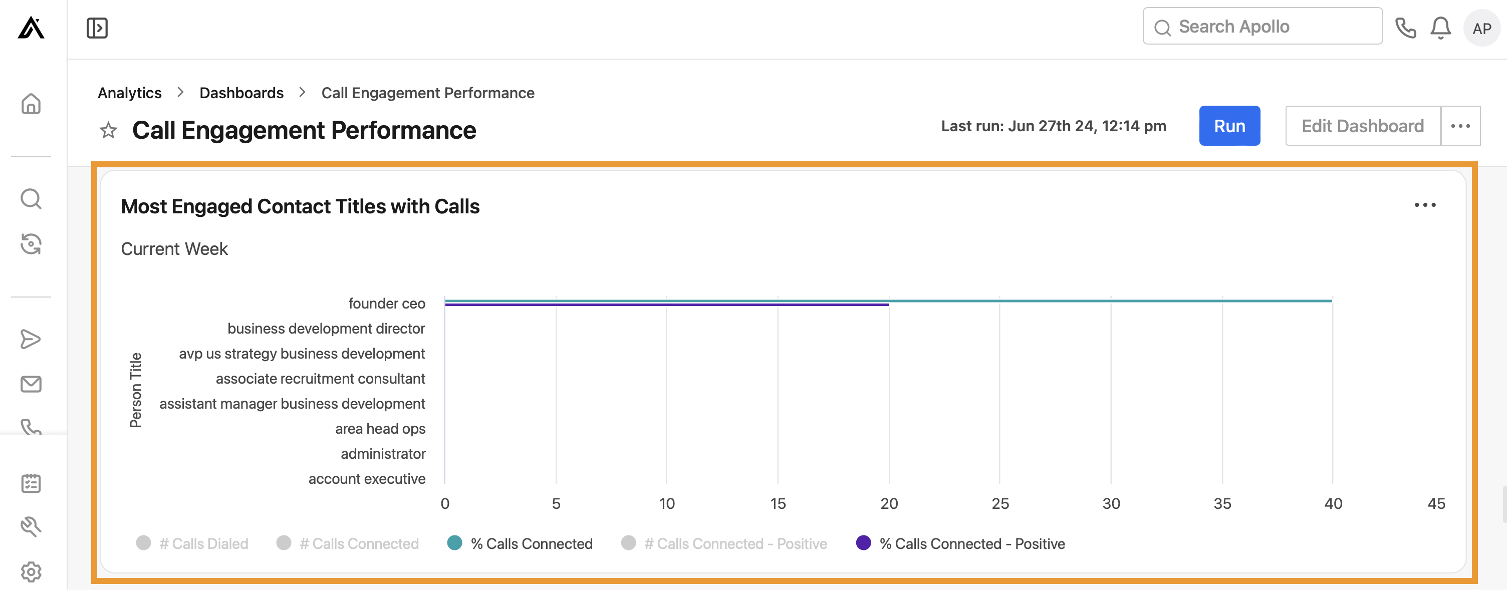
- Most engaged contact titles with calls: View the most engaged contact titles with the number of calls dialed, connected, and connected-positive, and the percentage of calls connected and connected-positive.
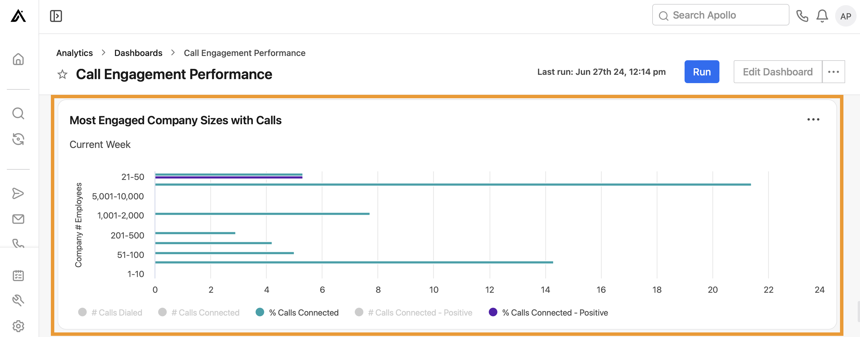
- Most engaged company sizes with calls: View the most engaged company sizes with the number of calls dialed, connected, and connected-positive, and the percentage of calls connected and connected-positive.
- Most engaged industries with calls: View the most engaged industries with the number of calls dialed, connected, and connected-positive, and the percentage of calls connected and connected-positive.
You have now used the call engagement dashboard.
Email engagement
Leverage this dashboard to gain insight into your team's email performance.
To use the dashboard, ensure you set the correct date range, and click Run. Then review the following widgets to see how you're performing:
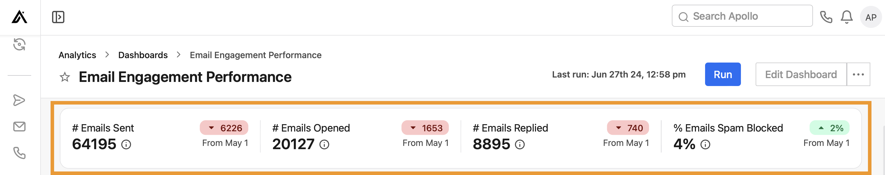
- # emails sent, # emails opened (excluding bot opens), # emails replied, % emails blocked: View high-level email touches across your team, with totals for each activity and the upward or downward trend over time. Hover over a statistic for more details.
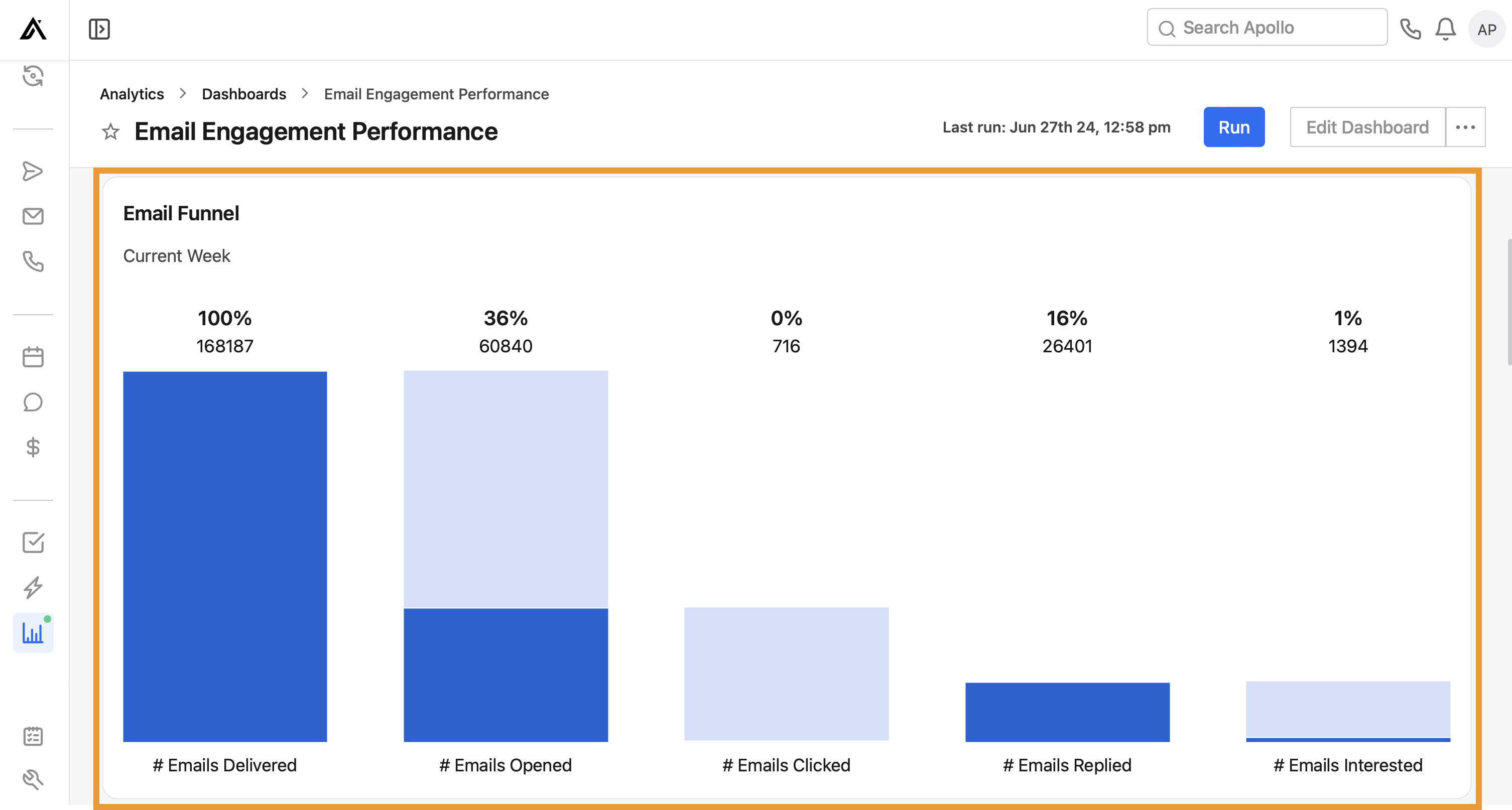
- Email funnel: Visualize email funnel performance. Each column represents the amount and percentage of contacts that moved from the prior status.
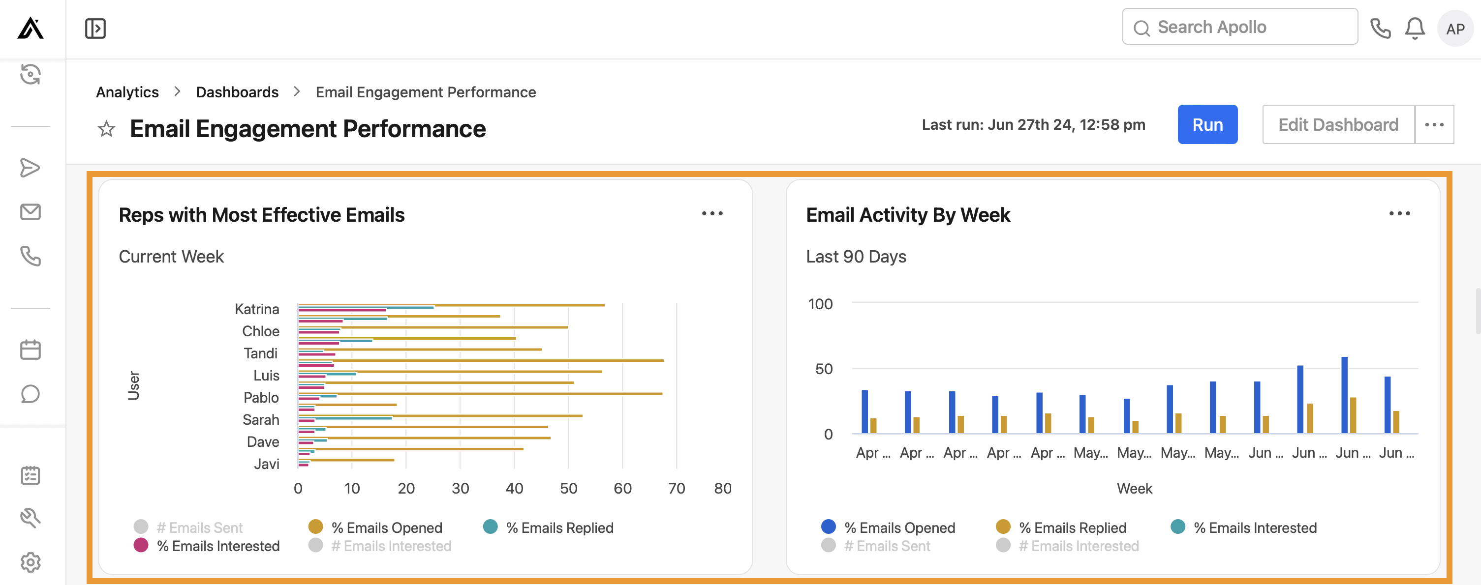
- Reps with most effective emails: View the reps with the most effective emails by number of emails sent and emails interested, and the percentage of emails opened (excluding bot opens), replied, and interested.
- Email activity by week: View email activity by week, with the number of emails sent and emails interested, and the percentage of emails opened (excluding bot opens), replied, and interested.
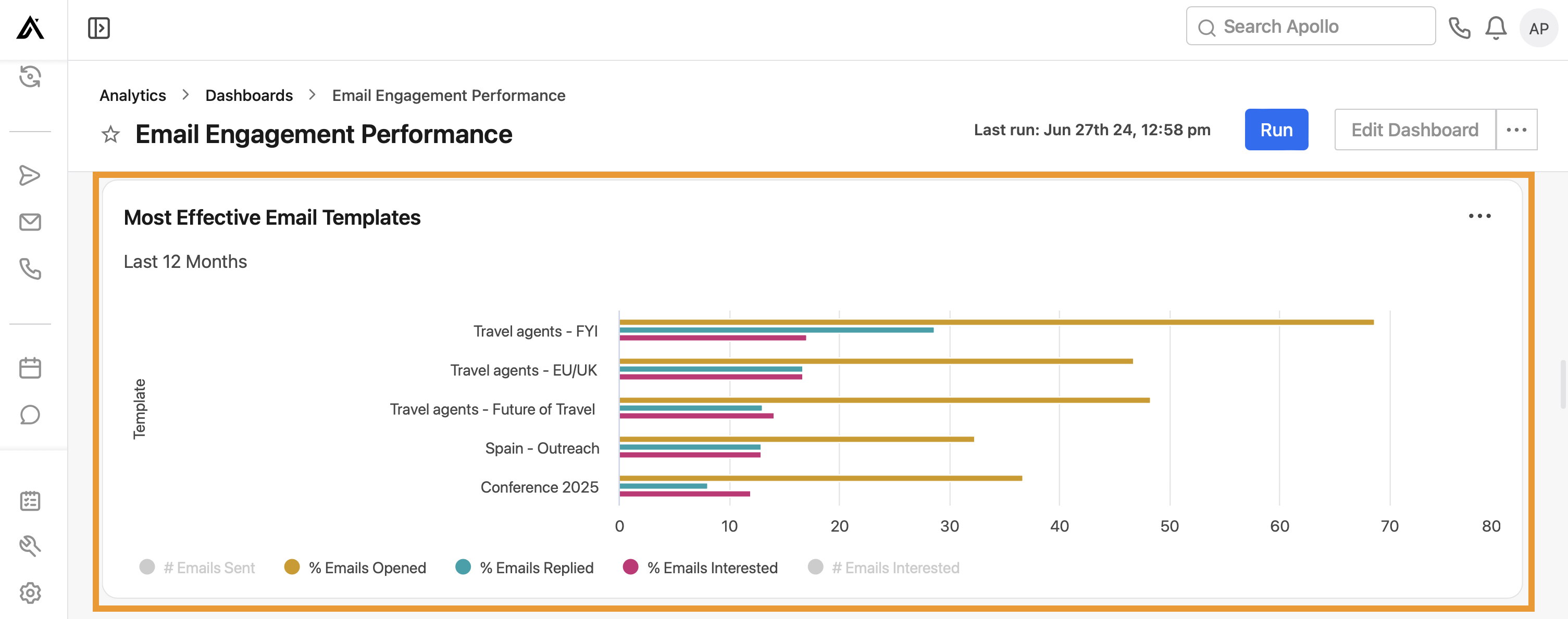
- Most effective email templates: View the most effective email templates in sequences by number of emails sent and emails interested, and the percentage of emails opened (excluding bot opens), replied, and interested.
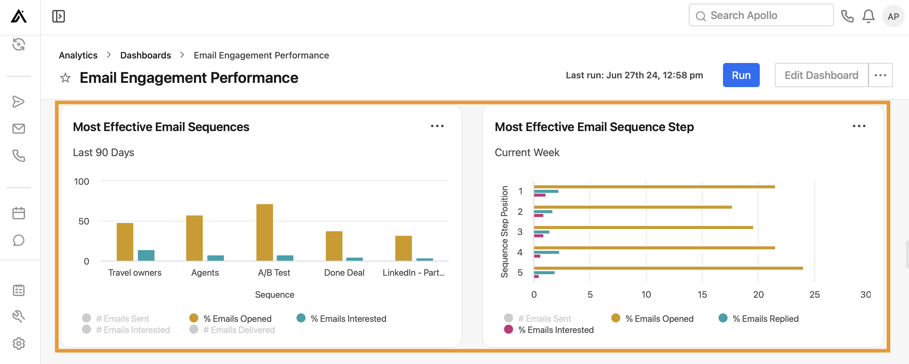
- Most effective email sequences: View the most effective email sequences by number of emails sent and emails interested, and the percentage of emails opened (excluding bot opens), replied, and interested.
- Most effective email sequence step: View the most effective email sequence steps by step position, the number of emails sent and emails interested, and the percentage of emails opened (excluding bot opens), replied, and interested.
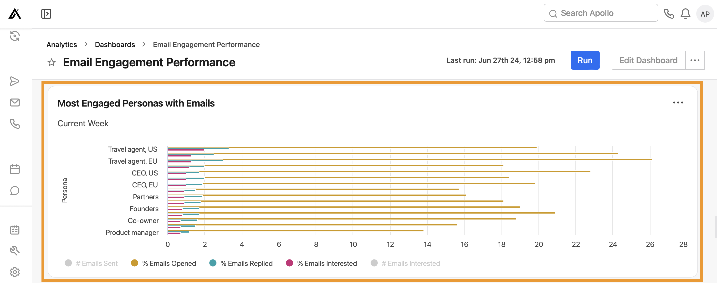
- Most engaged personas with emails: View the most engaged personas by number of emails sent and emails interested, and the percentage of emails opened (excluding bot opens), replied, and interested.
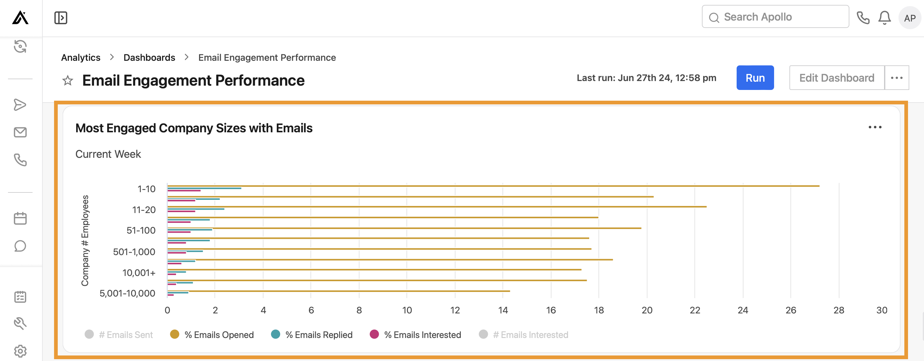
- Most engaged company sizes with emails: View the most engaged company sizes by number of emails sent and emails interested, and the percentage of emails opened, replied, and interested.
- Most engaged industries with emails: View the most engaged industries by number of emails sent and emails interested, and the percentage of emails opened (excluding bot opens), replied, and interested.
You have now used the email engagement dashboard.
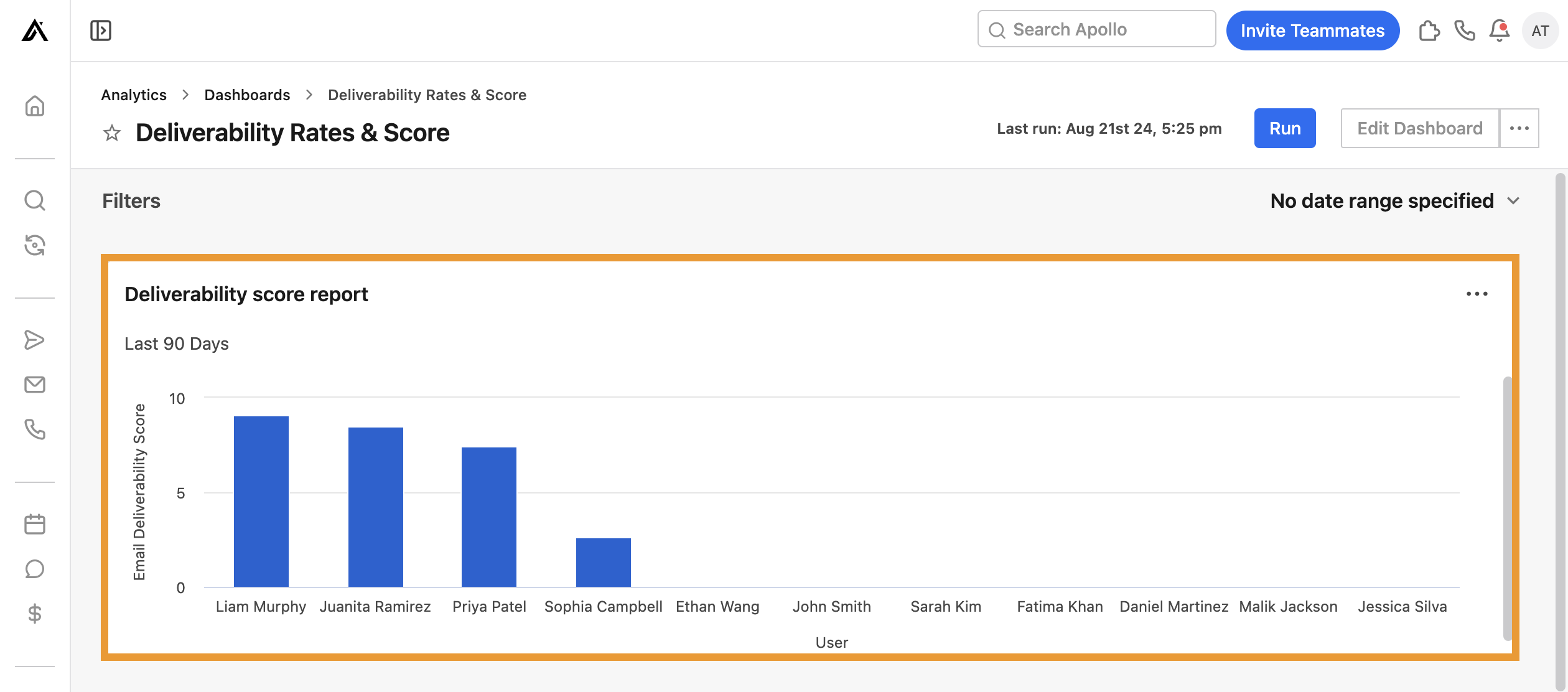
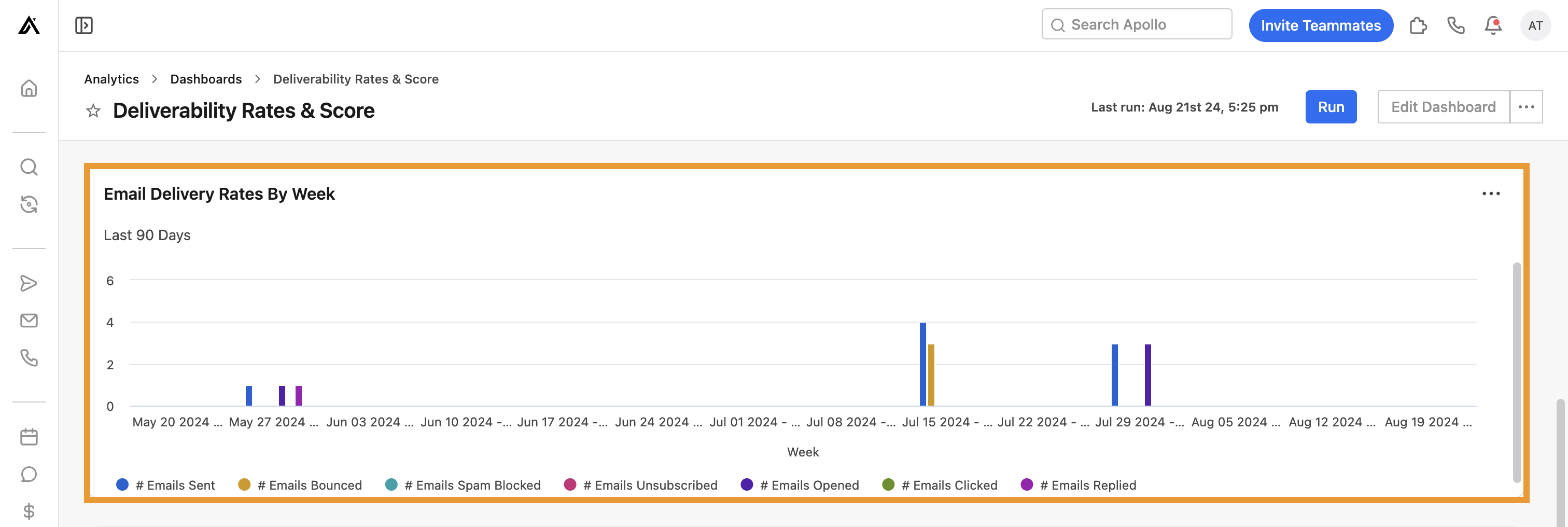
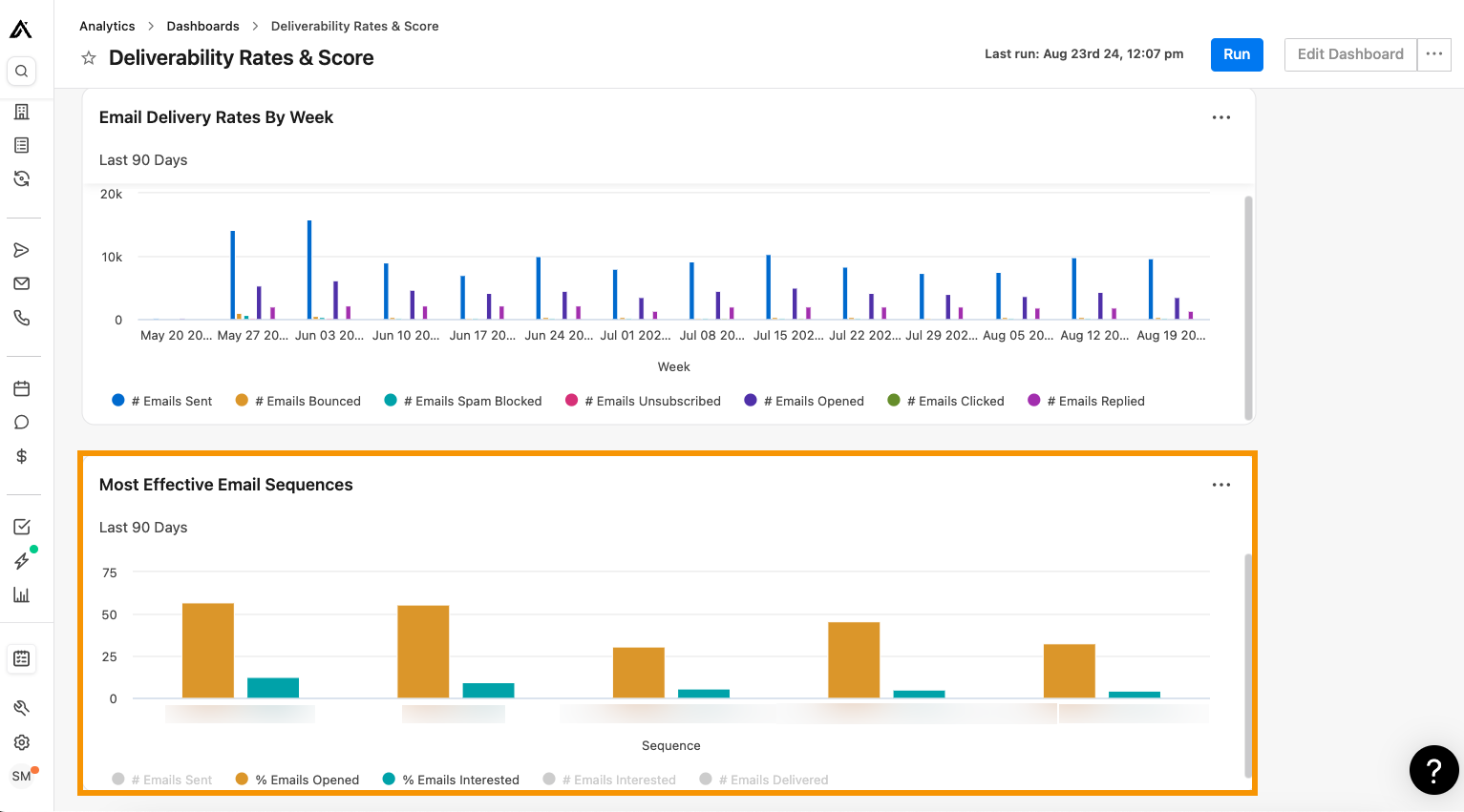
Deliverability rates & scores
Leverage this dashboard to easily monitor email deliverability rates and scores for activites and sequences across your team.
To use the dashboard, ensure you set the correct date range, and click Run. Then review the following widgets to see how you're performing:
- Deliverability score report: View the email deliverability score from the last 90 days for each user on your team. Use this widget to quickly assess each team member's deliverability score.
-
Email delivery rates by week: View the email delivery rates per week for the last 90 days across your entire team. Each week Apollo displays the following activities:
- # Emails sent
- # Emails bounced
- # Emails spam blocked
- # Emails unsubscribed
- # Emails opened
- # Emails clicked
- # Emails replied
- Most effective email sequences: View the email sequences with the highest deliverability rates for your team. Use this widget to identify effective sequence strategies and find opportunities for improvement.
Want to improve your email deliverability rates? Hop into Chapter 7 of the Outbound Sales book to learn all about deliverability or check out Apollo's deliverability best practices in this article.
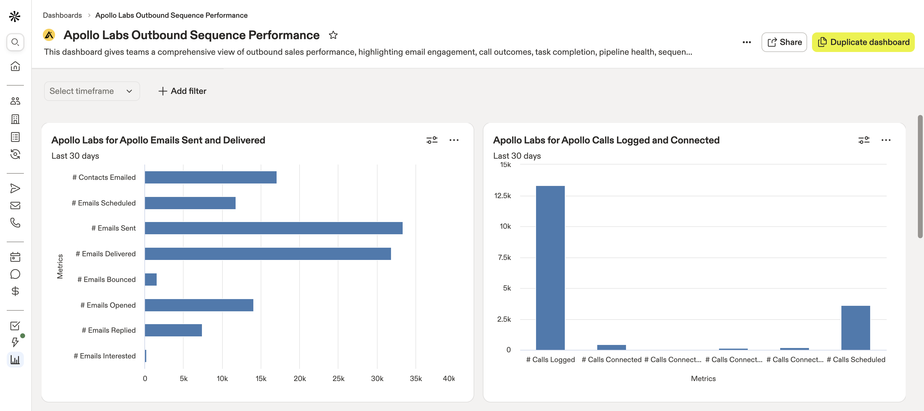
Apollo Labs outbound sequence performance
Leverage this dashboard from Apollo Labs to gain a comprehensive view of your outbound sales performance, identify areas for improvement, and discover the activities that provide you the highest ROI. This dashboard provides highlights related to your team's email engagement, call outcomes, task completion, pipeline health, sequencing activity, and website visitor behavior.
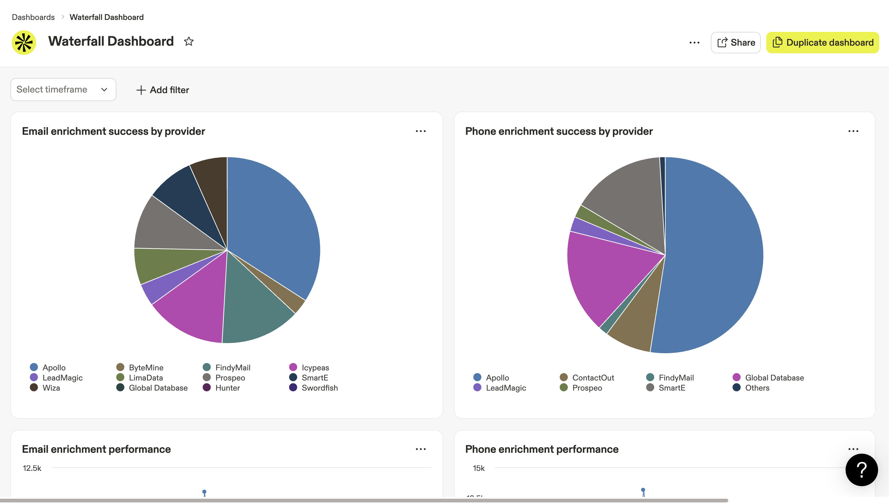
Waterfall dashboard
Use the waterfall dashboard to report on key waterfall enrichment metrics, including your Apollo credit usage for waterfall, enrichment success by provider, and your team's enrichment performance. You can also apply filters to track dashboard metrics by user or data source.
Learn more about reporting on your team's waterfall enrichment activities.
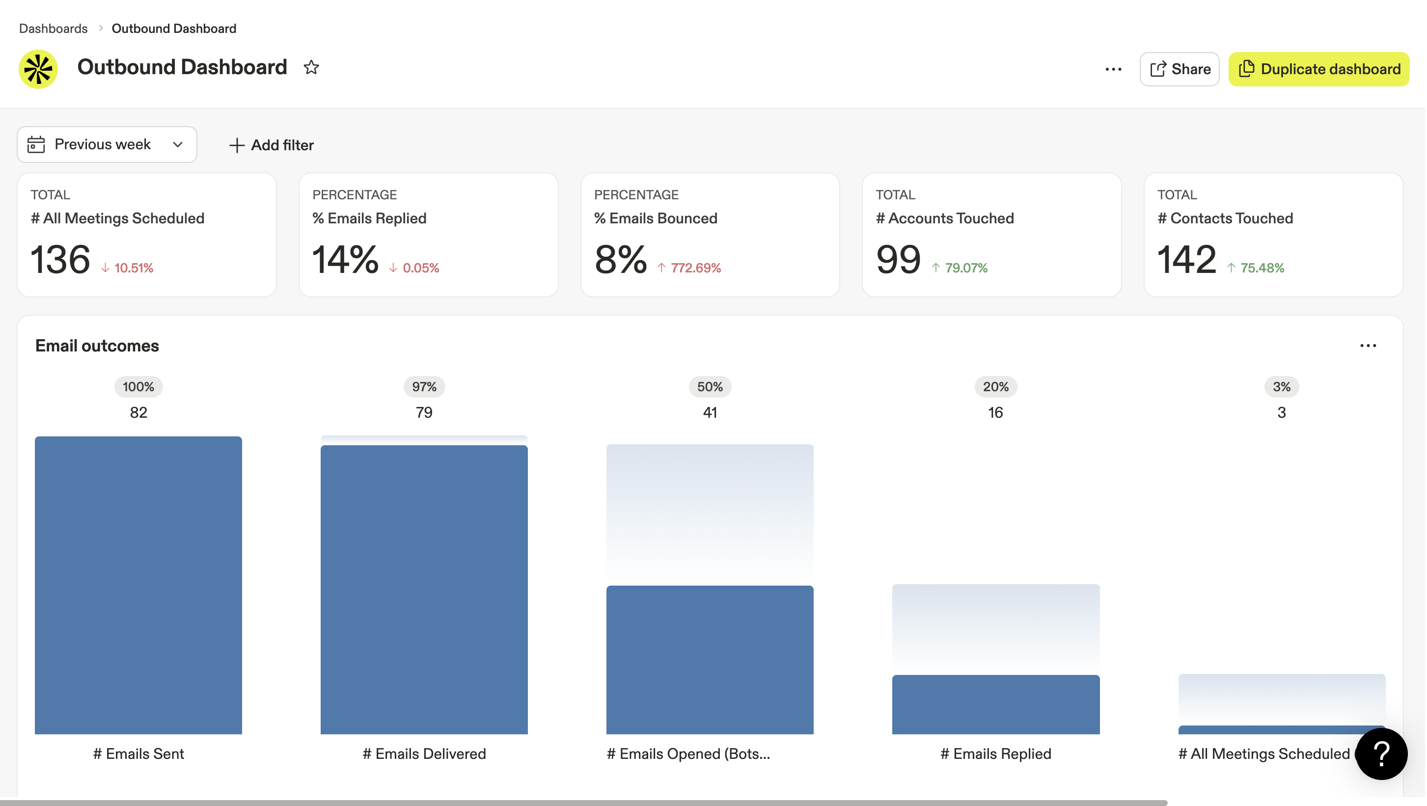
Outbound dashboard
Use the outbound analytics dashboard to help your team measure revenue outcomes from your go-to-market campaigns and get direct insight into the performance of your multi-channel sequences. Leverage key metrics like email outcomes, call sentiment over time, and sequence performance to compare the effectiveness of your campaign strategies and diagnose bottlenecks in your outbound funnel.
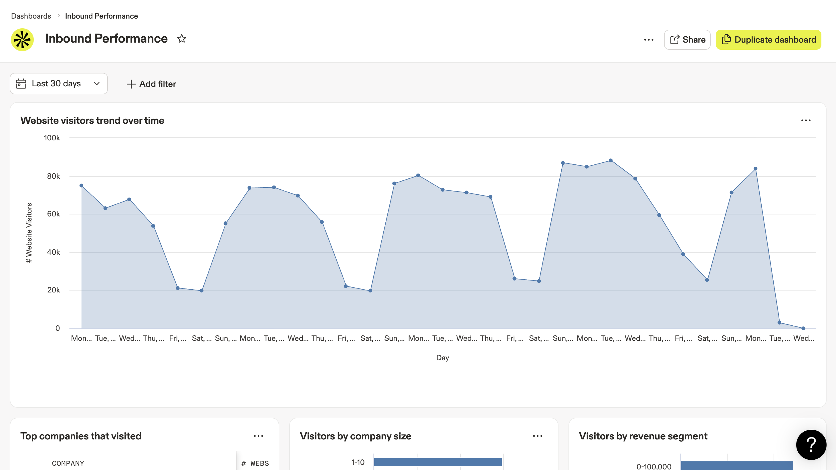
Inbound performance
Use the inbound performance dashboard to get a clearer picture of your website visitors and track their movement through your inbound funnel. Leverage key metrics like total forms submitted, total meetings scheduled, website visitors over time, and visitors by revenue segment to capture how often visits convert to booked meetings.
Create a Dashboard
Some Apollo plans include access to custom reports and dashboards. If your team needs to create a custom dashboard, upgrade your plan. If you have questions about upgrading, reach out to the Apollo sales team.
To build a custom dashboard:
- Launch Apollo and click Analytics > Dashboards.
- Click Create dashboard.

- Click the new dashboard's title to rename your custom dashboard.

- Click Existing or template to begin building your new dashboard with report widgets.
Click Create new report if you need to build a custom report to include in your new dashboard. Want to know more about a particular report? Learn more about the pre-built reports created by Apollo.

- Drag and drop any existing report from the Add report menu to the empty dashboard. Click x when you're done adding report widgets.

- Click and drag ⋮⋮ to reorganize the widgets in your custom dashboard. Click Delete to remove a widget from your dashboard.

- Click Save dashboard when you're done.

Your new custom dashboard is now available from the list in Dashboards.
Do it faster and easier with the AI Assistant on Apollo. Check out how to use the AI Assistant to create a custom analytics dashboard.
Edit a Dashboard
You can edit your custom-built dashboards at any time. To edit a custom dashboard:
- Open the custom dashboard you want to edit from Dashboards.
- Click Edit dashboard.

Dashboards pre-built by Apollo can't be edited. If you want to create a custom version of an Apollo-built dashboard, open the dashboard and click Duplicate dashboard to create a copy that you can edit.
- Click Add reports to add more report widgets to dashboard.
- Click and drag ⋮⋮ to reorganize the widgets in your dashboard. Click Delete to remove a widget from your dashboard.
- Click Save dashboard to save your edits.

You've now edited a dashboard.
Share a Dashboard
You can manage access permissions to allow your entire team or select team members to view your custom dashboard. To share access:
- Open your custom dashboard from Dashboards.
- Click Share.

- Under Share with, enter the email or name for each user or team you want to give access to your dashboard.
- Set their access permissions to one of the following:
- Full access
- Can edit
- Can view

- To share your custom dashboard with everyone in your company, set visibility to Everyone.

- Click Done to save your changes.
Next Steps
Want to turn dashboard snapshots into decisions your team can actually act on? Start here.
| Analytics Overview | Use get the full analytics picture to spot where your team should drill deeper before you build or tweak dashboards. |
|---|---|
| Use Analytics Reports | Use break performance down in reports to validate what your dashboard trends really mean and turn patterns into coaching or process changes. |
| Report on Deals | Use track deal analytics to connect outreach activity with pipeline movement, forecasted revenue, and rep-level results. |
| Build an Outbound Sales Process: Monitor Your Analytics | Use monitor outbound performance to see which sequences, messages, personas, and industries are actually moving prospects forward. |
| Outbound Analytics Dashboard | Use stand up a prebuilt outbound dashboard to give your team a faster starting point for tracking emails, calls, accounts, and tasks in one place. |